
UX/UI ACTIVITIES
Market Research
Study Industry Leaders
Survey
Information Architecture
Ideation
Low Fidelity
High Fidelity Design
Prototype
Usability Testing
MY ROLES
Solo UX/UI Designer
TOOLS
Figma
Figjam
Google Meet
DURATION
12/01/2023
to
12/25/2023
(90 hours)
The project encompassed a comprehensive range of UX/UI activities, mentioned above. Moving forward, I will spotlight pivotal activities that steered key decisions and project shaping. For a detailed overview of all project facets, please refer to the 'View Case Study' button above. The areas of focus are:"
Survey
Information Hierachy
Ideation
High Fidelity
Prototype
User Testing
Introduction
Crafted by a dedicated single mother, Woof Bakery offers natural dog treats and nutritious cooked dog food.
The Problem
The business website observed following issues:
50% of users open on average 7 item pages and then abandon the site without moving any items into the cart. The hypothesis is that users are unable to determine which option is best based on relative features.
Additionally, 70% of users abandoned their shopping cart. Data shows that users abandon the cart at the registration page. Right now, users must make an account to purchase.

The Solution
Fortunately, the solution for WoofBakery is straightforward as refining the website’s information structure and enhancing the user experience, including:
Enhancing the Information Architecture and providing product details adequate for users to make informed purchase decisions.
Providing guest checkout option while making sure the checkout process is straightforward and simple.

Survey
A survey was sent out directly to WoofBakery’s customers as well as posting on dog owner social media groups to collect both qualitative and quantitative data.
26 people filled out the survey while 24 of them are our target customers.
The first section of the survey is to filter out our target user of WoofBakery website. Their profile looks includes:
Dog owner
Ages ranging from 24-50
Predominantly female
The second section is to study :
How dog health conscious the target user is?
How important are the various product details to the target users when making online purchase decisions of natural pet food?
INGISHTS FROM SURVEY
When making purchase decision, WoofBakery’s target audience consider various factors together such as Cost, Health Benefits, Ingredients, Feeding Instruction, Customer Review, Packaging & Storage, Quality, Freshness.

Information Hierarchy
SITEMAP
After conducting user research, studying industry leaders, and engaging with the business owner, I’ve obtained valuable insights to design the Information Architecture of WoofBakery’s ecommerce platform.
Given the critical insight that the audience will abandon their purchase if information needed to make decision are insufficient, I opted to a flat sitemap model (see chart below). This approach is to reduce friction and cognitive load when users browsing the site, making it easier for users to find the information they need to make informed purchase decisions.
The sitemap provides a direct path to each product line(e.g. Cooked Food, Treat and Pawty Cake) and an option to view the product menu (Shop Now) based on their purpose of use (Meals & Topper, Chews, Training Treats etc.) By incorporating more than one information presentation style, the site aimed to serve different thought processes and preferences of users.

USER FLOW
According to the Product Manager, the observed user behavior where 50% of users open on average seven item pages but abandon the site without adding items to the cart is indicative of potential friction in the user journey. This aligns with George Miller’s cognitive theory that a person can hold approximately seven items in their working memory. This might implies that users had to go to each product page, where site abandonment happened, in order to add item to cart.
To streamline the add-to-cart process and mitigate abandonment, its crucial to allow users to add items to cart without navigating to individual product pages. This strategy not only reduces clicks required for a transaction, but also enhances the user experience.
Additionally, as the data indicating a 70% cart abandonment at the registration page emphasizes the need for a more flexible checkout process. Currently users must make an account to purchase. To address this challenge, the site should allow users to purchase without mandatorily registering. Guest checkout implementation will be able to reduce friction and increase the likelihood of completing the transaction.

Ideation
HOMEPAGE
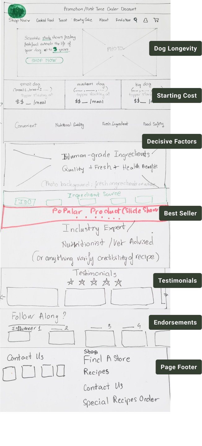
In my design process, I prioritized highlighting the theme of dog longevity, a key driver in the natural pet food trend according to previous research. With a background encompassing five years of managing a pet hotel and eight years as a Key Opinion Leader in the local dog community, I deeply understand the emotional impact that the desire for increased dog longevity holds for pet owners.
Following that, I prominently placed cost estimations to reassures our audience about the affordability of our products. This strategy also serves as a filter to identify and engage our intended customers. Additionally, the wording “topper starting at” subtly communicates that our products can be integrated into their pets' existing diet, offering flexibility and avoiding the imposition of a complete dietary shift, as I learned from industry leader studies that such an approach can be off-putting.
Closely following insights from our research, I ensured that other decisive factors such as convenience, cost, health benefits, ingredients, and freshness – identified as critical factors in the purchase decision-making process – were strategically addressed to evoke a strong buying desire in users.
PRODUCT PAGE
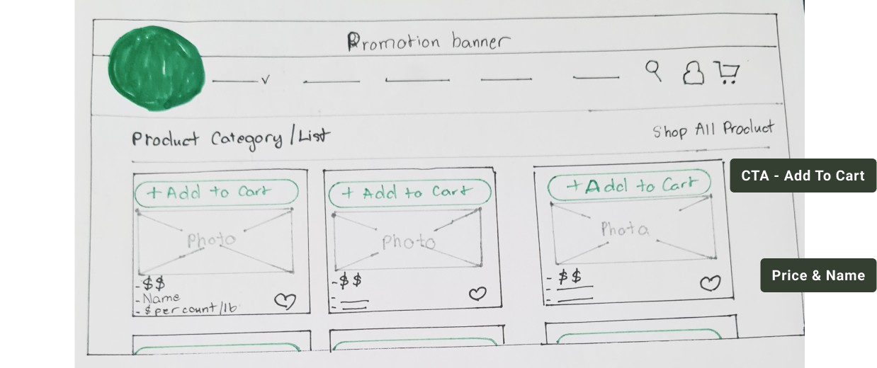
I purposefully crafted the product page with a minimalist design, while placing CTA buttons to be prominent on top of each product card. Crucial product details, including product name and price, are immediately visible upon initial interaction.
Users can directly add items to cart directly from this page, eliminating the necessity to navigate to individual product pages. This design aims to reduce cognitive load and achieve an efficient shopping experience.
GUEST CHECKOUT PAGE
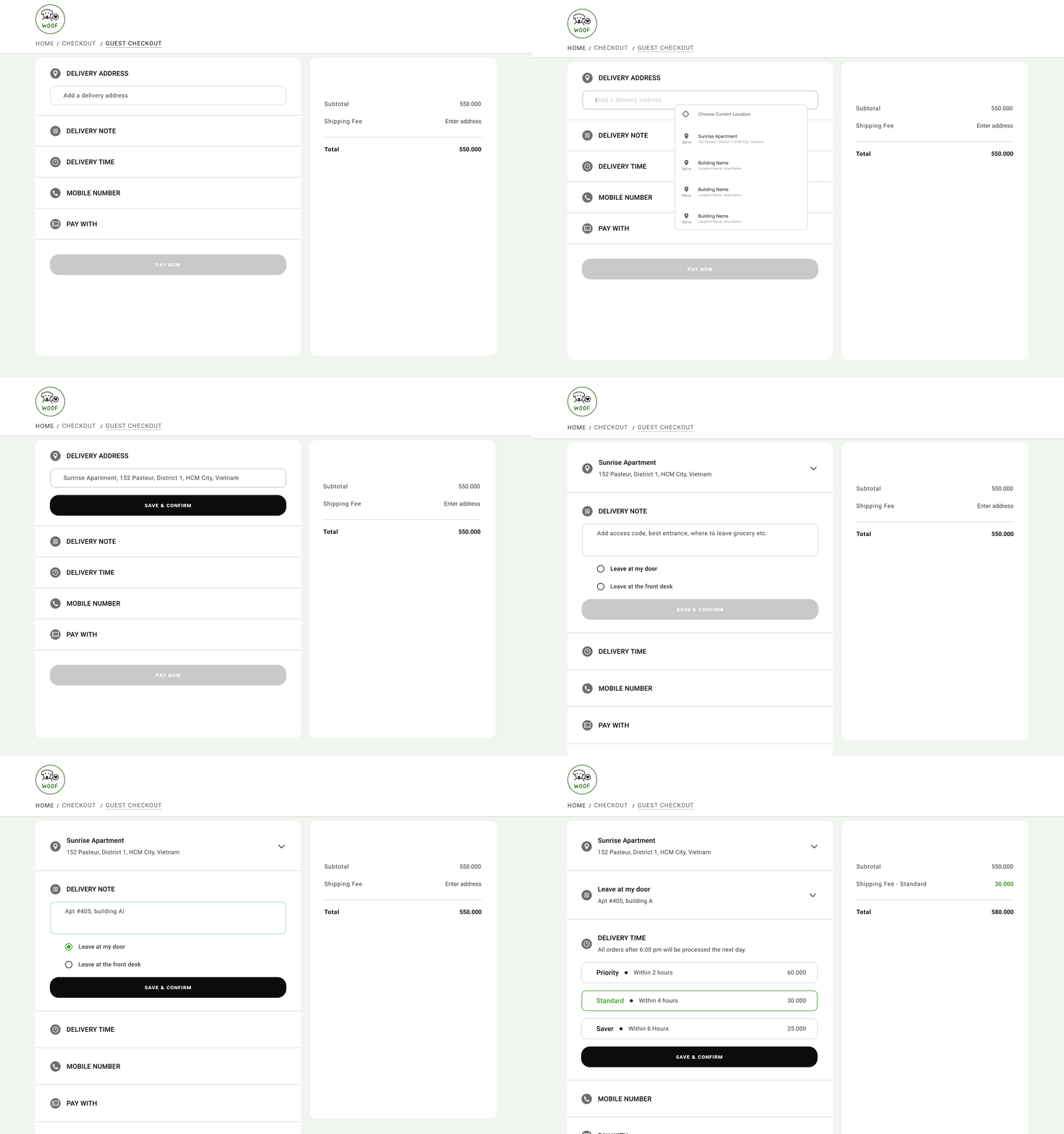
Designing the guest checkout page posed a challenge. It requires a process tailored specifically to WoofBakery’s products-fresh dog food. At the same time, the process needs to be straightforward, efficient and clear.
After exploring various dog food websites without finding a suitable model, I turned to businesses with the similarity of fresh food delivery, not exclusively in the pet food domain.
I finally found inspiration from Instacart, a food delivery and pickup service is used widely in the US and Canada. Instacart’s checkout system collects essential information for grocery delivery by dividing information into sections. This design has well applied Hicks Law and progressive disclosure to ensure seamless user experience without overwhelming users.

High Fidelity
The high-fidelity design follows closely our visual design strategy (see photos below), incorporating with the use of colors, photography and animation. Every design decision has been thoughtfully made to achieve the following objectives:
Maintain the green, organic vibe
Ensure the clarity of information for user comprehension
Maximize the convenience of the purchase action
COLOR
The website maintains a natural and inviting atmosphere with a soothing mint background and black typography, and bold calls-to-action (CTA).+


When hovering over CTAs, they transition to a welcoming green (see photos below), signaling users to proceed with ease.


PHOTOGRAPHY
My photography strategy aims to:
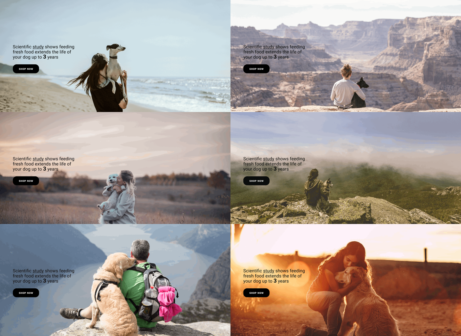
Capture the bond between dogs (representing various breeds) and their humans in diverse situations, eliciting emotions from different types of dog owners who share concerns about their dogs’ health.

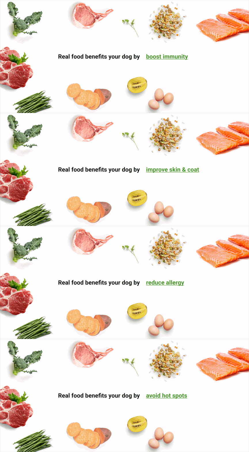
Present ingredient photos against a clean white background to emphasize the freshness and ‘real food’ quality of WoofBakery’s products.

Display product photos on a white background to allow customers to focus exclusively on the product itself.

ANIMATION
Utilizing a photo slideshow featuring diverse dog breeds engaging in activities with their owners, the aim is to resonate with a wide range of users, evoking emotions and tapping into their memories of bonding with their dogs.
Implementing a sequential animation to illustrate the various health benefits of WoofBakery’s products serves to engage users and facilitates easier comprehension of information, avoiding overwhelming them with a long list.
Utilizing animations to present relevant information step by step during the checkout process aims to simplify the user experience and prevent information overload.
FINAL DESIGN
Usability Testing
Usability tests were conducted two times, each time with five participants who fall into WoofBakery’s target users. The test’s goals are:
Ensure easy browsing (How users navigate through the website, and the clarity of its Information Architecture)
Evaluate Information Accessibility: (Whether users can access the information necessary to make informed purchase decisions)
Evaluate "Add to Cart" Functionality (the ease of adding items to from various pages on the site)
Evaluate Guest Checkout Experience: ( Maximizing the simplicity and intuitiveness of the "Check Out As Guest" option)
INSIGHTS
When selecting checkout options, 60% of users experienced a momentary hesitation to identify the tasked option to checkout (Checkout As Guest), even though it was the first option listed. There were two possible causes for this issue:
Proximity law not applied effectively: objects on the page are not well grouped adequately to convey the presence of three distinct checkout options (Checkout As Guest, Express Checkout and Sign Up/Sign In).
Unclear visual hierarchy/contrast: Despite being the first option listed, Checkout As Guest lacks a prominent CTA button compared to the strong contrast of other two options. The design failed to communicate a clear information hierarchy, causing the users to overlook the preferred guest checkout option.
Recommendation:
To improve the issue, I redesign the Checkout Page to show three options as distinct buttons without other distracting elements, allowing users to seamlessly choose their preferred checkout method.


Lessons Learned
Certain valuable lessons have emerged throughout this project, prompting personal growth and enhancing my skills as a designer. Reflecting on these experience, I have learned the following:
Users prefer more information with fewer clicks: Users prefers to have the critical information visibly displaced, and the fewer clicks or actions required to accomplish a task.
Design must align with user mental model: personally, I think Chews is its own category because of its distinct purpose. However, in our target user’s perspective, they think “Chews” is considered a type of treat, as its something enjoyable and edible for the dog. I need to take into account the user’s mental model and how they would intuitively navigate through the size and design accordingly to maximize the user-friendly experience.
CHECK OUT MY OTHER PROJECTS
This site is hand-crafted, with care. - Thea


