
Overview
Process
Empathize
Secondary Research
I opted to secondary research method to comprehend the market trend and customer preference. The involved meticulous observation and analysis of discussions and insights related to natural dog food across various authoritative sources:
Online forums
Veterinary studies
Academic journals
Articles featured on veterinary website
Pet magazines
Key Opinion Leader (KOL) blogs.
This approach allowed for a thorough examination of valuable information within the available resources. (See below photo for the list of data resources).
Secondary Research Insights
The repeated themes driving dog owners toward a natural diet for their pet include the pet humanization trend, the desire for increased dog longevity and the associated and health benefits.
Accordingly, Woof Bakery’s website needs to emphasize above theme/benefits to motivate users to make purchase decisions.
On the other hand, factors that discourages dog owners from this diet are concerns about cost, inconvenience, possibility of nutritional deficiency, storage requirement and the transition challenge. Hence, Woof Bakery’s website should strategically present information that directly addresses users’ questions and concerns related to these discouraging factors.
Survey
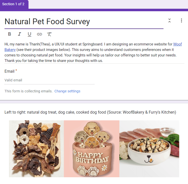
A survey(photo below) was sent out directly to Woof Bakery’s customers as well as posting on dog owner social media groups to collect both qualitative and quantitative data.
26 people filled out the survey (see photo below) while 24 of them are our target customers.
The first section of the survey is to filter out our target user of Woof Bakery website. Their profile looks includes:
Dog owner
Ages ranging from 24-50
Predominantly female
The second section is to study :
How dog health conscious the target user is?
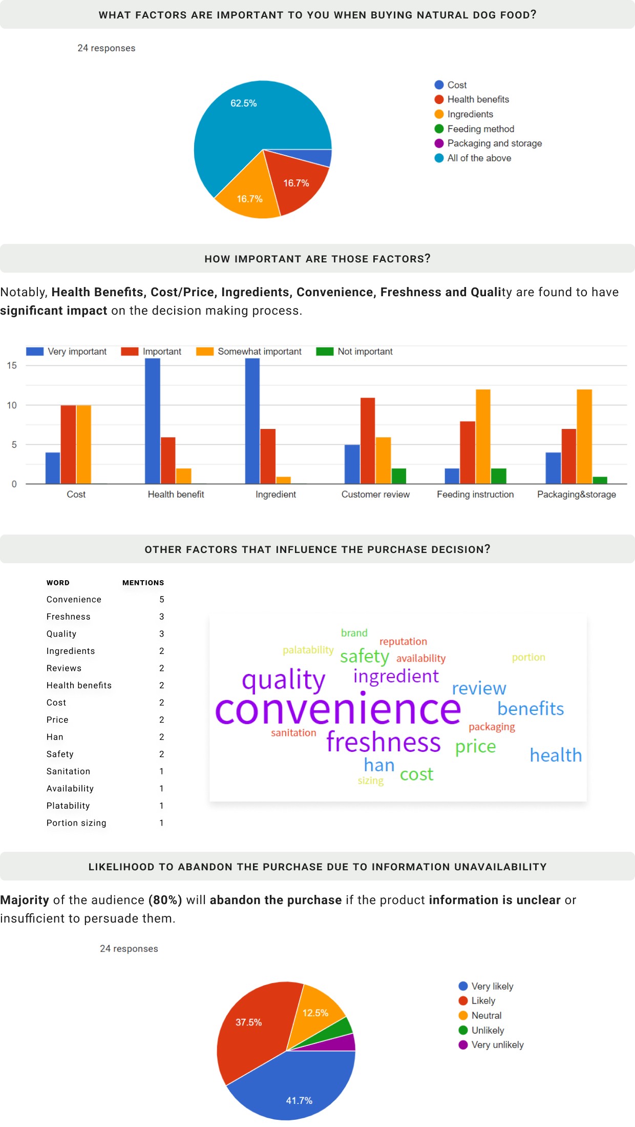
How important are the various product details to the target users when making online purchase decisions of natural pet food?
Survey Insights
When making purchase decision, WoofBakery’s target audience consider various factors together such as Cost, Health Benefits, Ingredients, Feeding Instruction, Customer Review, Packaging & Storage, Quality, Freshness.
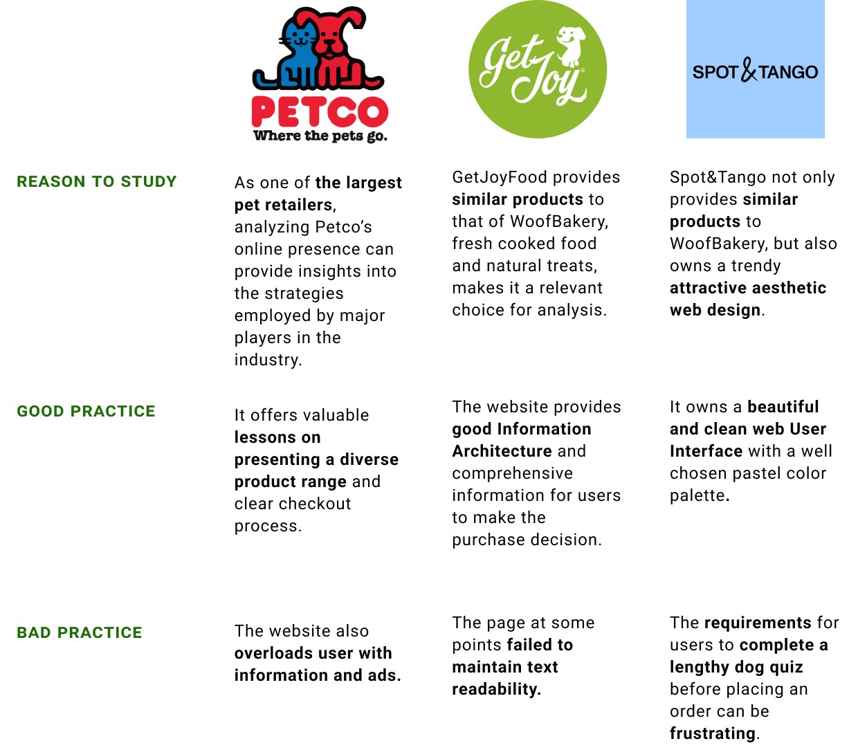
Competitive Analysis
GetJoyFood's website provides good information architecture, while Sport&Tango's website offers strategies to implement a clean and trendy aesthetic interface.
In order to build a trendy and well functioning website for Woof Bakery, analyzing good and bad practices from industry leaders in the fresh dog food industry is a vital first step. After researching the market and consult with ChatGPT, I picked out Petco, GetJoyFood and Spot&Tango to study.
Define
How Might We
How might we create an e-commerce site that provides sufficient information for purchase decision-making, ensures seamless navigation, and simplifies the guest checkout experience for Woof Bakery's website users, while implementing a vibe that emphasizes the brand attributes?
Design
Information Architecture
Flat sitemap model is implemented to reduce friction and cognitive load.
After conducting user research, studying industry leaders, and engaging with the business owner, I’ve obtained valuable insights to design the Information Architecture of Woof Bakery’s ecommerce platform.
Given the critical insight that the audience will abandon their purchase if information needed to make decision are insufficient, I opted to a flat sitemap model (see chart below). This approach is to reduce friction and cognitive load when users browsing the site, making it easier for users to find the information they need to make informed purchase decisions.
The sitemap provides a direct path to each product line(e.g. Cooked Food, Treat and Pawty Cake) and an option to view the product menu (Shop Now) based on their purpose of use (Meals & Topper, Chews, Training Treats etc.) By incorporating more than one information presentation style, the site aimed to serve different thought processes and preferences of users.

User Flow
Allowing users to add items to the cart without navigating to individual product pages and implementing guest checkout to reduce cart abandonment rates.
According to the Product Manager, the observed user behavior where 50% of users open on average seven item pages but abandon the site without adding items to the cart is indicative of potential friction in the user journey. This aligns with George Miller’s cognitive theory that a person can hold approximately seven items in their working memory. This might implies that users had to go to each product page, where site abandonment happened, in order to add item to cart.
To streamline the add-to-cart process and mitigate abandonment, its crucial to allow users to add items to cart without navigating to individual product pages. This strategy not only reduces clicks required for a transaction, but also enhances the user experience.
Additionally, as the data indicating a 70% cart abandonment at the registration page emphasizes the need for a more flexible checkout process. Currently users must make an account to purchase. To address this challenge, the site should allow users to purchase without mandatorily registering. Guest checkout implementation will be able to reduce friction and increase the likelihood of completing the transaction.

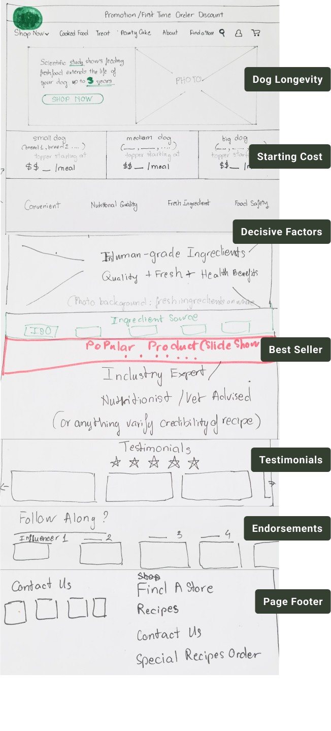
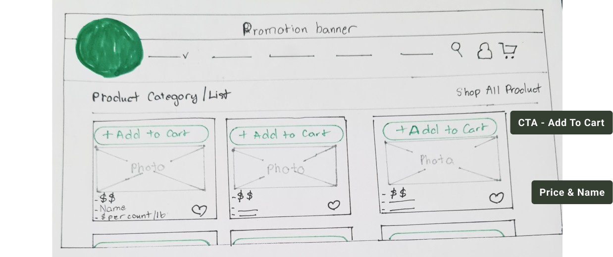
Sketches
My sketches followed closely strategies planned out during Information Architecture and User Flow stages. However, I encountered challenges in mapping out the Guest Checkout process due to insufficient research on the matter.
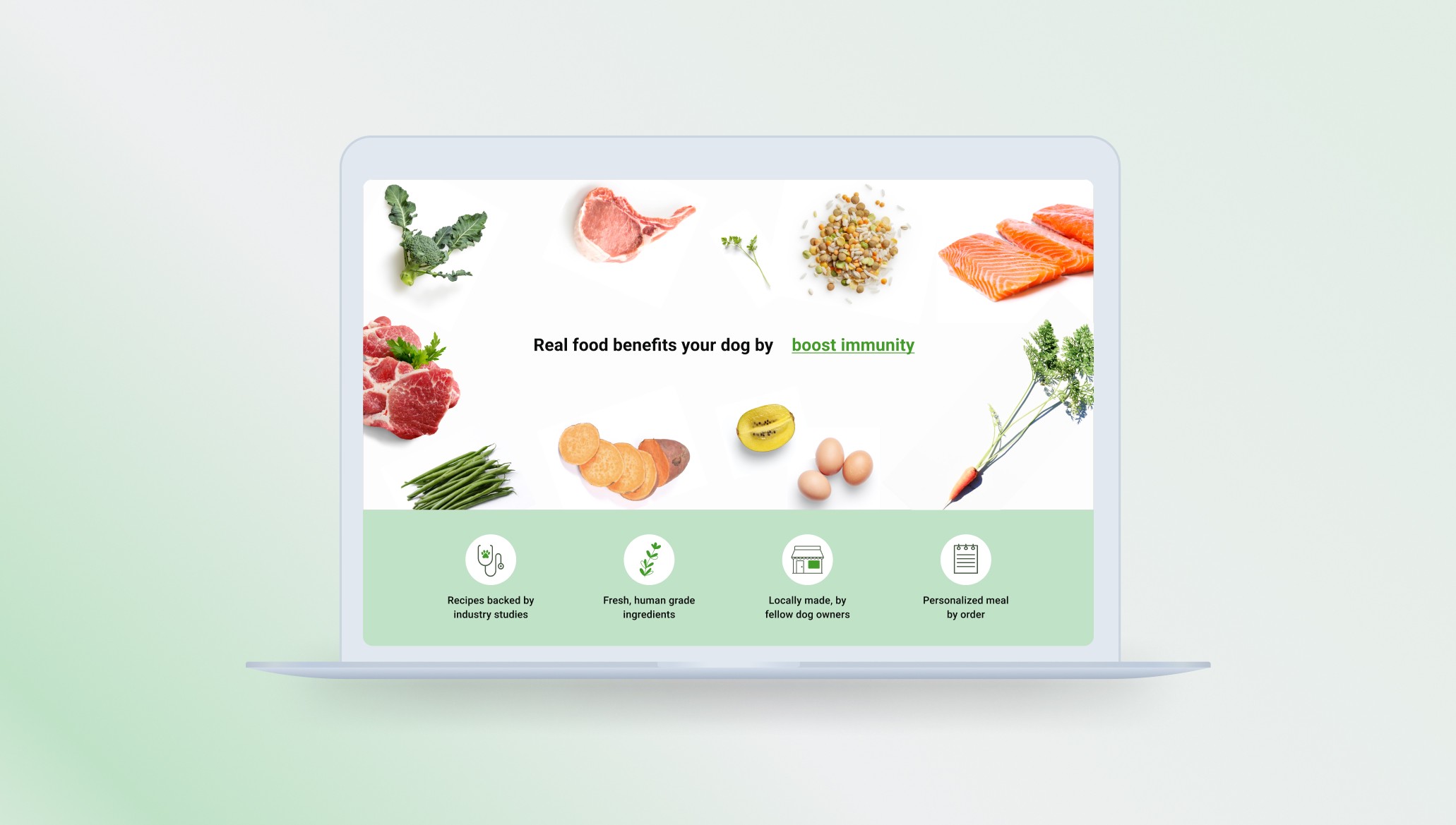
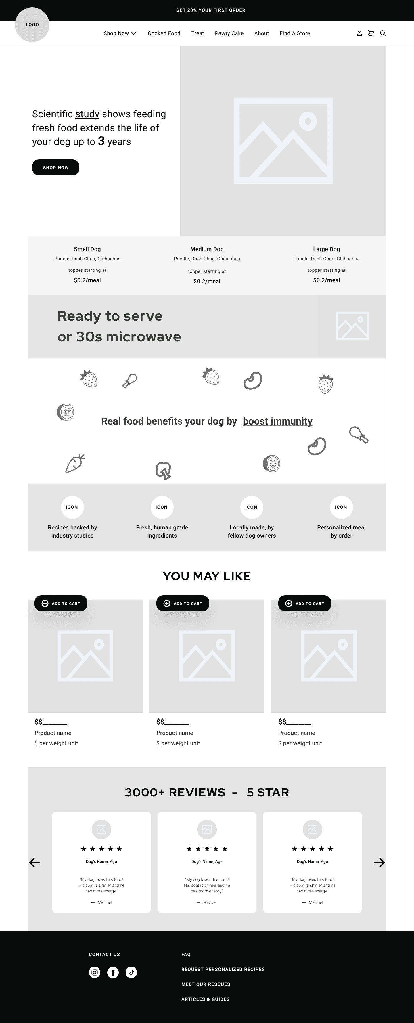
HOMEPAGE
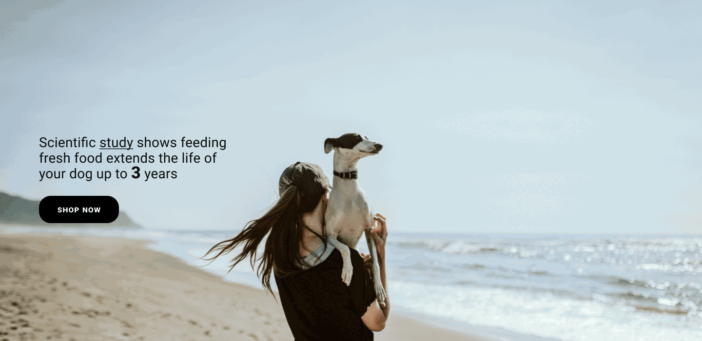
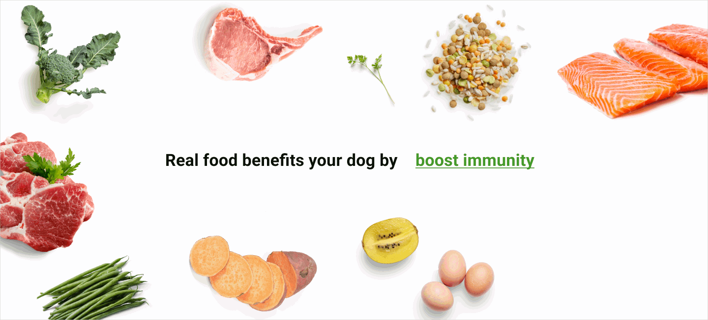
In my design process, I prioritized highlighting the theme of dog longevity, a key driver in the natural pet food trend according to previous research. With a background encompassing eight years as a Key Opinion Leader in the local dog community, I deeply understand the emotional impact that the desire for increased dog longevity holds for pet owners.
Following that, I prominently placed cost estimations to reassures our audience about the affordability of our products. This strategy also serves as a filter to identify and engage our intended customers. Additionally, the wording “topper starting at” subtly communicates that our products can be integrated into their pets' existing diet, offering flexibility and avoiding the imposition of a complete dietary shift, as I learned from industry leader studies that such an approach can be off-putting.
Closely following insights from our research, I ensured that other decisive factors such as convenience, cost, health benefits, ingredients, and freshness – identified as critical factors in the purchase decision-making process – were strategically addressed to evoke a strong buying desire in users.
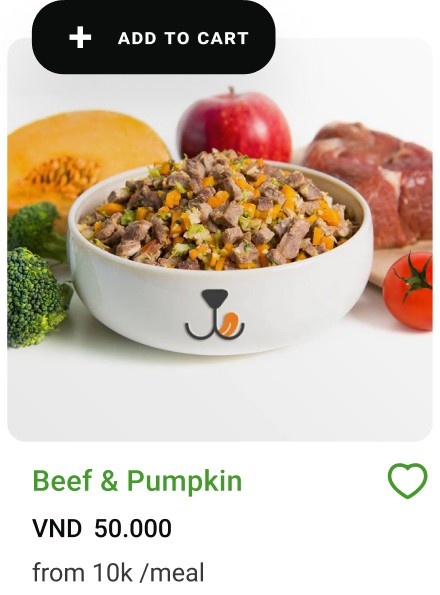
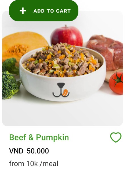
I purposefully crafted the product page with a minimalist design, while placing CTA buttons to be prominent on top of each product card. Crucial product details, including product name and price, are immediately visible upon initial interaction.
Users can add items to cart directly from this page, eliminating the necessity to navigate to individual product pages. This design aims to reduce cognitive load and achieve an efficient shopping experience.
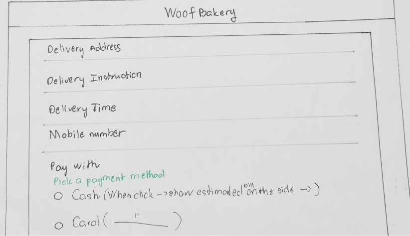
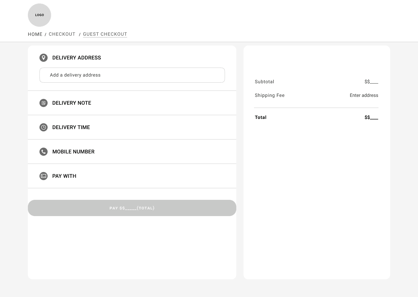
At this point, I realized my user research had only focused on understanding the factors influencing purchase decisions, unintentionally overlooking why customers might abandon their carts at checkout. While I knew I had to design the guest checkout process, I needed clarification on why users abandoned their carts. To address this, I researched common reasons for cart abandonment, such as insecure payment systems, complicated input forms, and lack of communication about the checkout process state.
Additionally, I explored beyond the dog food market, studying the checkout processes of businesses with similarities in fresh food delivery, particularly Instacart.
Low-Fidelity
Along with learning from other online grocery websites, I keep our low-fidelity design closely aligned with the Information Architecture and sketches (see photos below), with the following goals:
Address essential factors that are important to the decision making process of users
Optimize the “Add to Cart” process for maximum efficiency
Embrace a minimalist but informative design
Ensure a no-friction, straightforward, guest checkout process.
HOMEPAGE
Address essential factors that are important to the decision making process of users.
PRODUCT LIST PAGE
Efficient “Add to Cart” process:
Applying Fitz Law by enhancing the visibility of the CTAs, placing it prominently on top of each product card in a bold color.
INDIVIDUAL PRODUCT PAGE
Minimalist but informative interface.
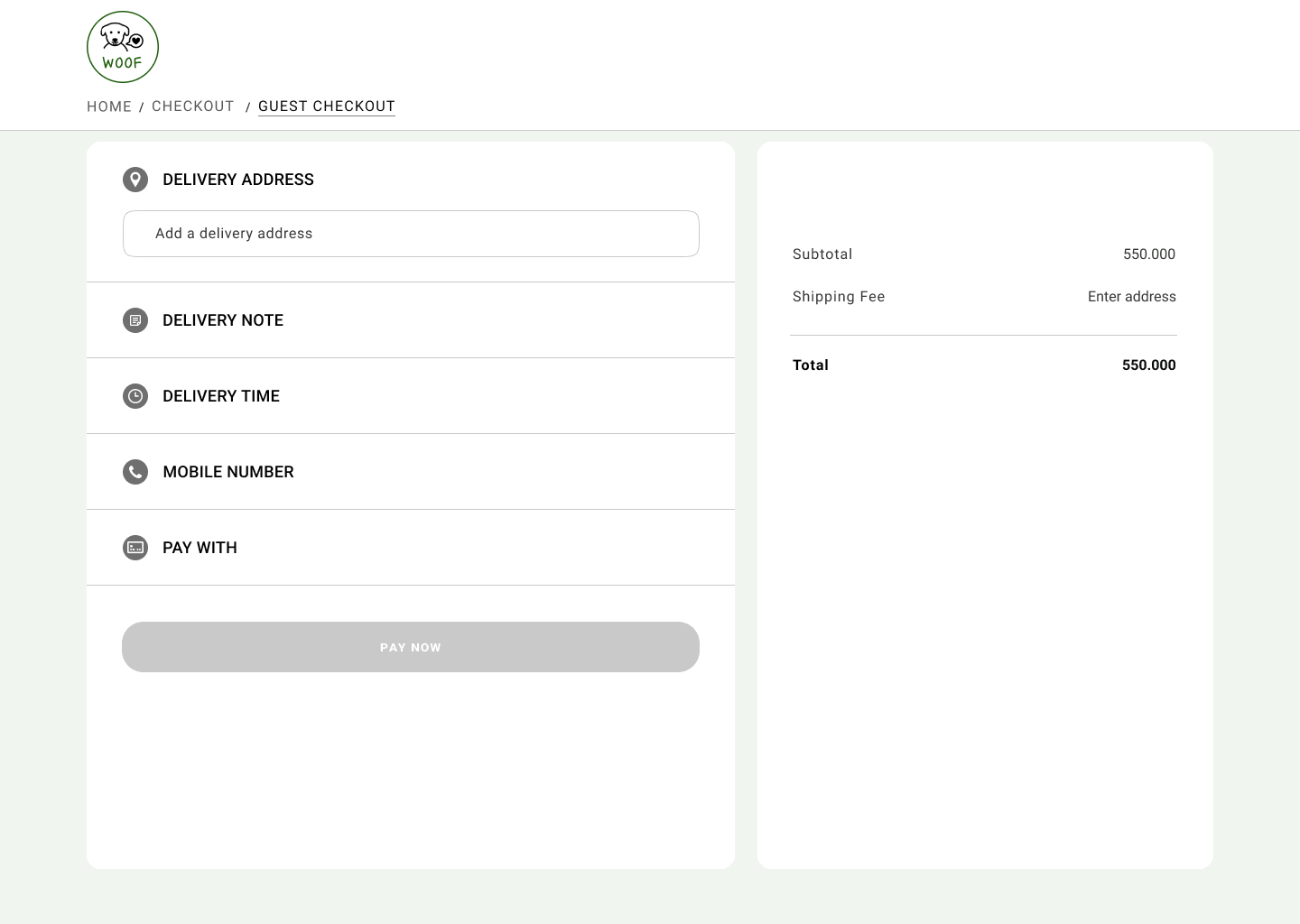
GUEST CHECKOUT PAGE
No-friction guest checkout process.
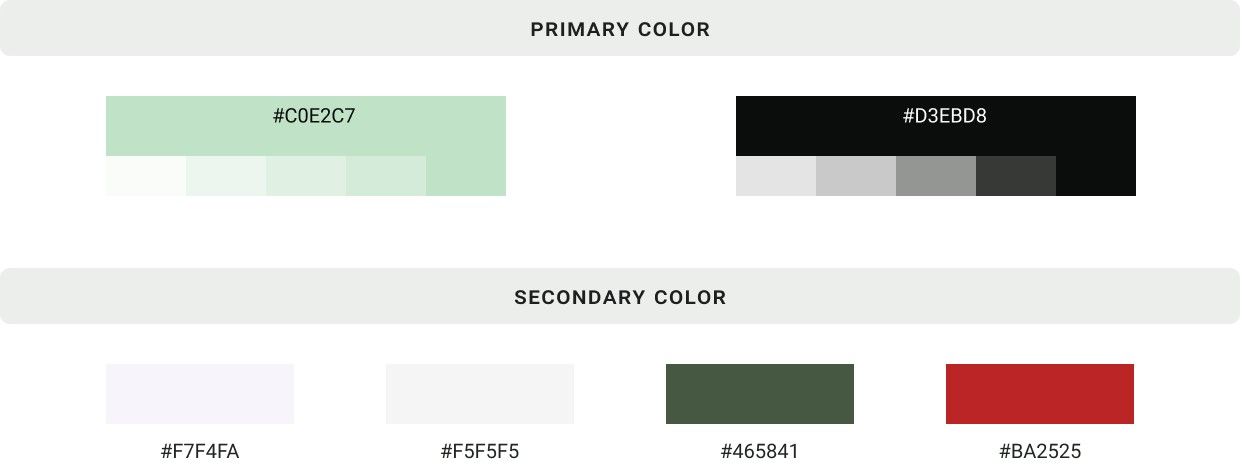
Style Guide
Brand colors and typography were chosen to convey the fresh, natural attributes of Woof Bakery products, as well as represent the brand's core values: Natural, Caring, Holistic, Trustworthy, and Ethical.
Brand color palette:
I settled a soothing mint as the primary color for Woof Bakery. Green, symbolizing life, nature, vibrant health, renewal and grow aligns seamlessly with WOOF’s ethos of offering natural food and treat for dogs.
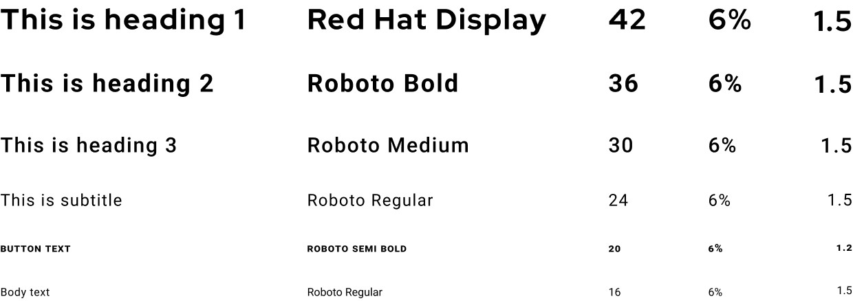
Brand typography:
The choice of the Roboto font, a modern and versatile typeface, stems from its excellent readability across platforms.
For Heading 1, I opted for Red Hat Display. Similar to Roboto in its minimal decorative strokes, Red Hat Display gives a bolder impression in H1 font size.
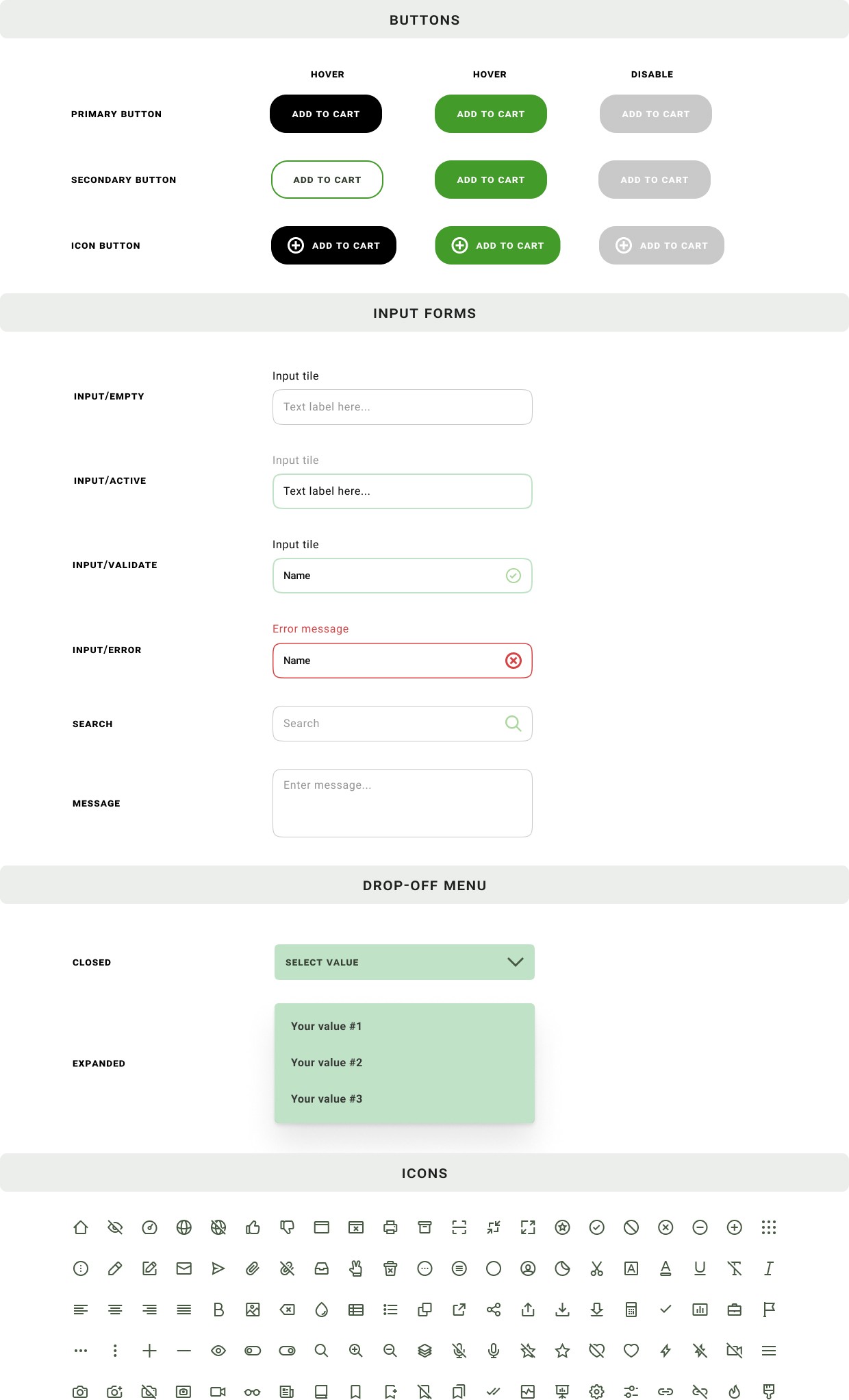
Brand UI components:
The utilization of rounded corner buttons serves a strategic purpose in evoking a playful and inviting vibe. The design intention is to instill feelings of happiness and comfort among users as they navigate and shop on the page.
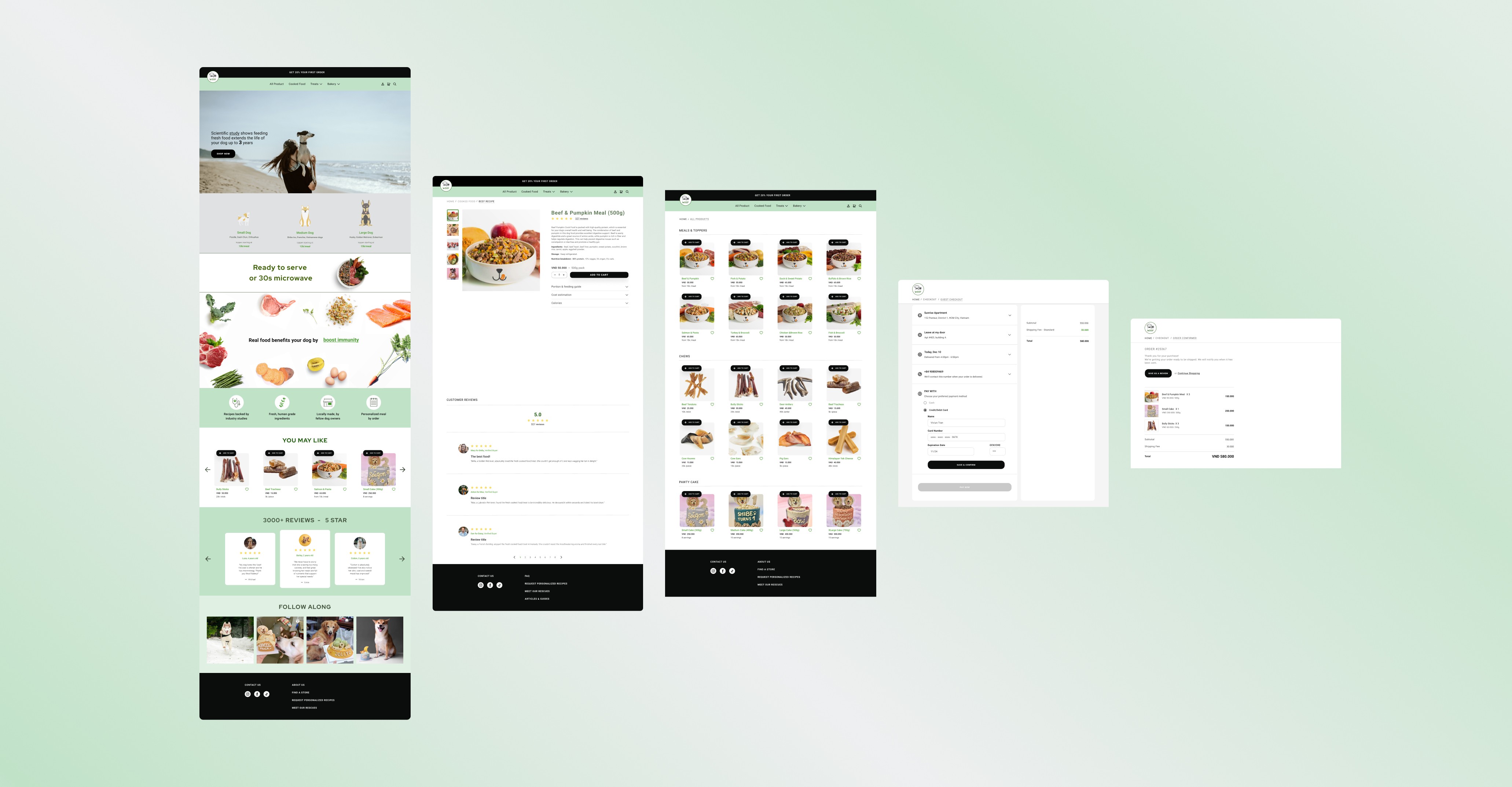
High Fidelity
The high-fidelity design combined with the use of colors, photography and animation to deliver :
The green, organic vibe
Clarity of information for decision making
The convenience of the purchase action.
The use of color:
The website maintains a natural and inviting atmosphere with a soothing mint background and black typography, and bold calls-to-action (CTA).
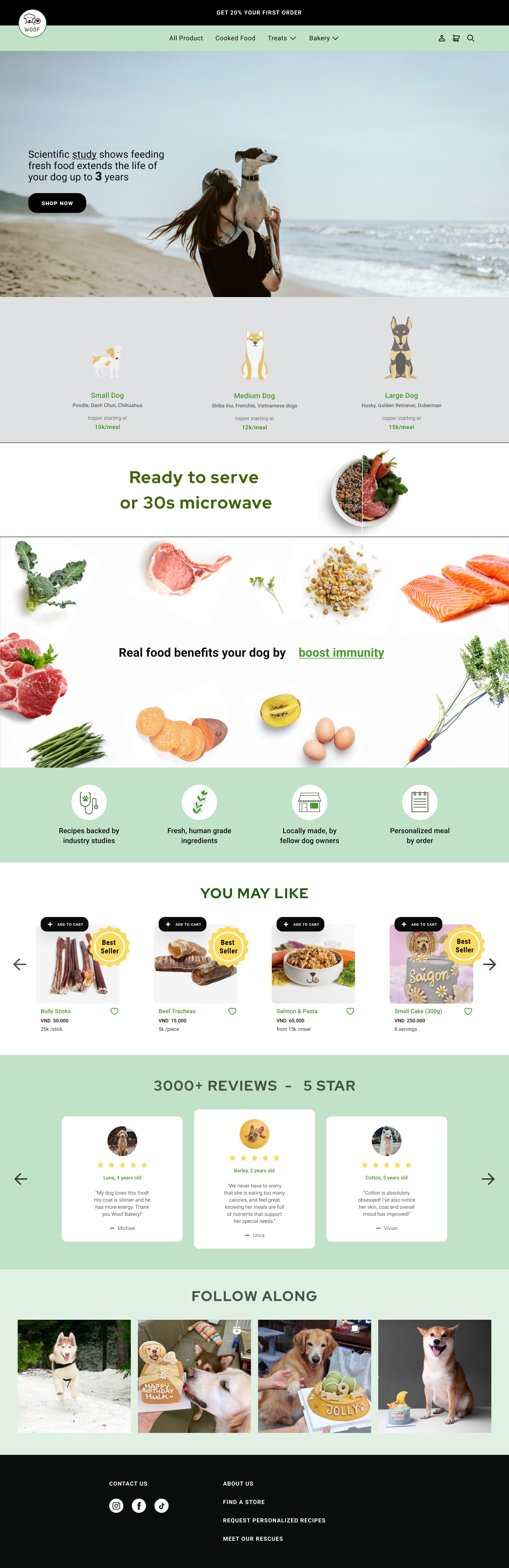
Primary colors are also employed for the default and hover states of CTA buttons.
The use of photography:
Imagery aimed to capture the bond between dogs (representing various breeds) and their humans in diverse situations, eliciting emotions from different types of dog owners who share concerns about their dogs’ health.

Photos presented ingredients against a clean white background to emphasize the freshness and ‘real food’ quality of Woof Bakery’s products.

Photos displayed products on a white background, allowing customers to focus exclusively on the product itself.
The use of animation:
Utilizing a photo slideshow featuring diverse dog breeds engaging in activities with their owners, the aim is to resonate with a wide range of users, evoking emotions and tapping into their memories of bonding with their dogs.
Implementing a text animation to illustrate the various health benefits of Woof Bakery’ s products serves to engage users and facilitates easier comprehension of information, avoiding overwhelming them with a long list.
Utilizing animations to present relevant information step by step during the checkout process aims to simplify the user experience and prevent information overload.
Prototype
Play video to view our prototype in action.
User Testing
Test Result
All testers could seamlessly complete essential tasks such as managing meal plans and generating grocery lists during usability testing. Additionally, the users commented that they appreciated the clean and inspiring design.
Information Architecture
When tasked with navigating to the Chews product list, 80% of users looked for Chews product under Treats instead of Shop Now (see Original Sitemap photo), indicating a perception that Chews should be a subcategory of Treats.
Improve strategy: To solve this problem, I simplified the sitemap by reorganizing subcategories based on user preferences and ensuring all main product categories are prominently displayed for efficient browsing.


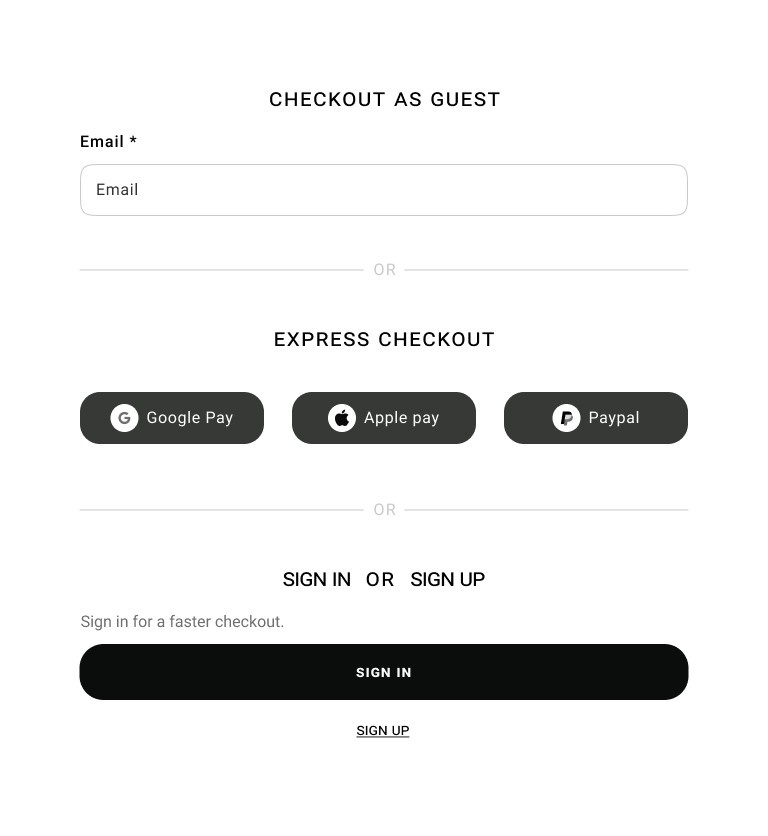
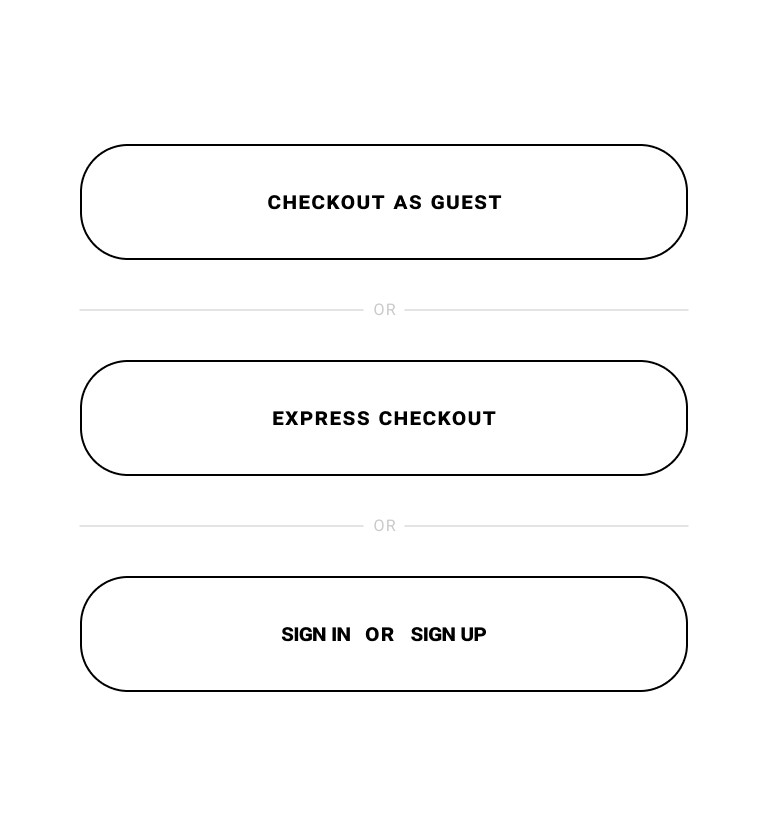
Guest Checkout Page
60% of users hesitated to select the Checkout As Guest option. The cause of this issue is that objects on the page are not well grouped adequately to convey the presence of three distinct checkout options (Checkout As Guest, Express Checkout and Sign Up/Sign In).
Improve strategy: To solve this issue, I redesign the Checkout Page to show three options as distinct buttons without other distracting elements, allowing users to choose their preferred checkout method seamlessly.
Outcome
Achievement
I've successfully designed an e-commerce experience for Woof Bakery that provides comprehensive purchase information, an intuitive, easy-to-navigate website, and a streamlined guest checkout process.
Lessons learned
Certain valuable lessons have emerged throughout this project, prompting personal growth and enhancing my skills as a designer. Reflecting on these experience, I have learned the following:
Users prefer more information with fewer clicks: Users prefers to have the critical information visibly displaced, and the fewer clicks or actions required to accomplish a task.
Design must align with user mental model: personally, I think Chews is its own category because of its distinct purpose. However, in our target user’s perspective, they think “Chews” is considered a type of treat, as its something enjoyable and edible for the dog. I need to take into account the user’s mental model and how they would intuitively navigate through the size and design accordingly to maximize the user-friendly experience.