
Overview
Overview
The Team
UX/UI Design
Timeline
1 week
Responsibilities
User Research Analysis
Competitive Analysis
Persona
User Journey
Sketch
High Fidelity
Prototype
User Testing
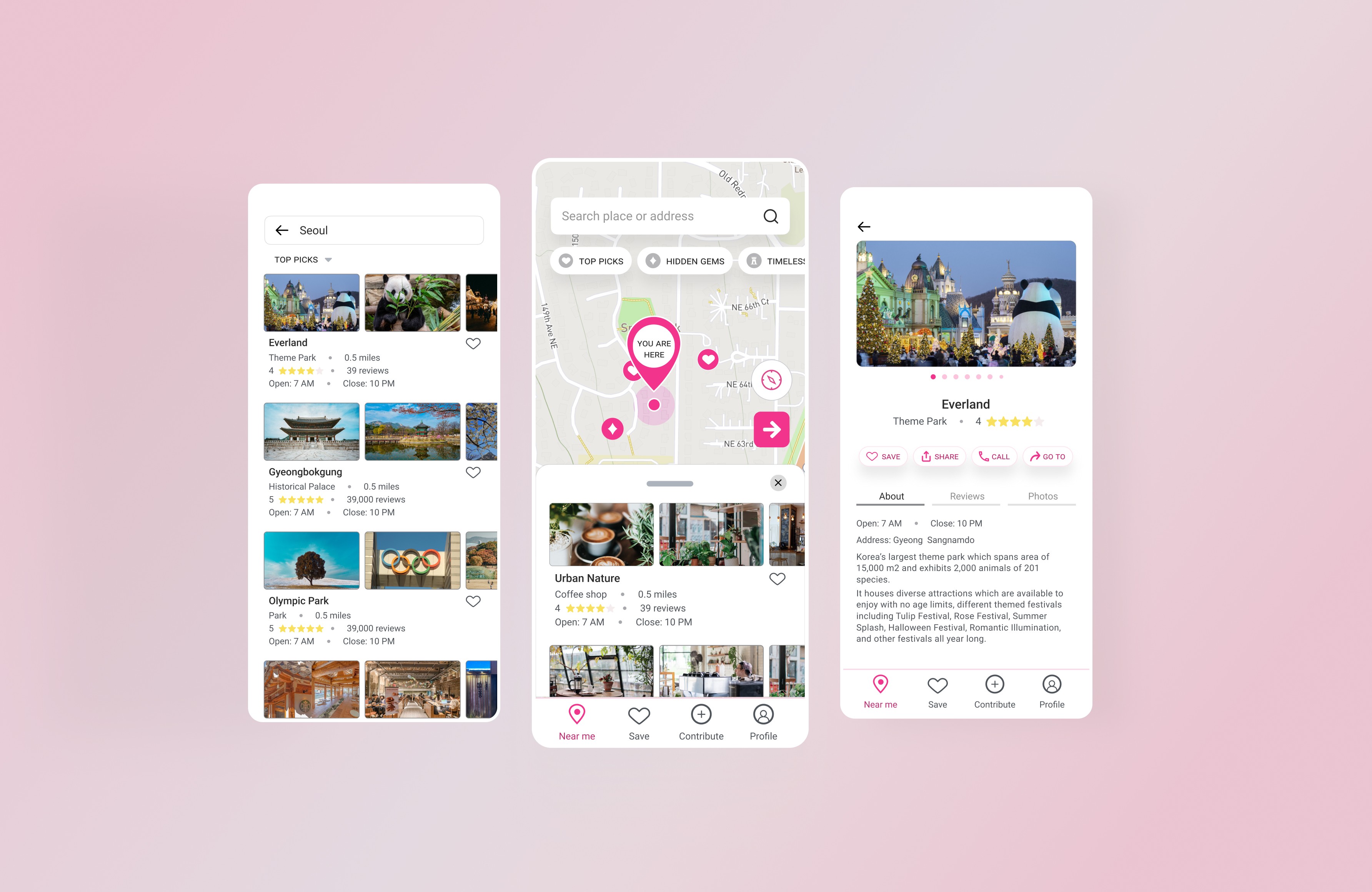
The Problem
When visiting a new place, people enjoy capturing photos of picturesque or iconic locations, whether for sharing on social media or keeping memories. However, it is a tedious process to research for impressive photo spots and organize the traveling around them. Additionally, missing out on nearby Instagram-worthy spots can be frustrating for users.
The Solution
Gram City is a mobile app designed to:
simplify the process of searching for captivating photo spots
planning routes
and navigating to the spots.
All functions are tailored to users' interests and travel preferences. By offering a seamless search experience, Gram City enables users to capture stunning photos and enhance their travel adventures, ensuring they make the most of their trips.
The Achievement
A mobile app design that successfully incorporated the needs and goals of all personas, receiving positive feedback from 80% of usability test participants.
The Team
UX Lead (Me)
2 UX Designers
Timeline
4 weeks
Responsibilities
Competitor Analysis
Persona
Design
Prototype
Testing
The Problem
The Dinner Daily is a web-based platform that offers weekly meal plans and grocery shopping assistance. The company was experiencing a concerning retention rate. The hypothesis is that users were struggling to perform essential tasks on the dashboard, which led to a low return rate, affecting user satisfaction and retention.
The Solution
We enhanced the dashboard interface by simplifying the user journey and providing a flexible, intuitive experience while highlighting The Dinner Daily's key services. The new design delivers a seamless experience with vibrant colors and smooth animations that delight users.
The Achievement
The improved design achieved a 100% success rate in completing two essential tasks: navigating the weekly meal plan and generating the grocery list.
The Team
2 UX Designers
UX Lead (Me)
Timeline
4 weeks
Responsibilities
Competitor Analysis
Persona
Design
Prototype
Testing
The Problem
The Dinner Daily is a web-based platform that offers weekly meal plans and grocery shopping assistance. The company was experiencing a concerning retention rate. The hypothesis is that users were struggling to perform essential tasks on the dashboard, which led to a low return rate, affecting user satisfaction and retention.
The Solution
We enhanced the dashboard interface by simplifying the user journey and providing a flexible, intuitive experience while highlighting The Dinner Daily's key services. The new design delivers a seamless experience with vibrant colors and smooth animations that delight users.
The Achievement
The improved design achieved a 100% success rate in completing two essential tasks: navigating the weekly meal plan and generating the grocery list.
Process
Empathize
Research Synthesis
Persona
Journey Mapping
Competitive Analysis
Define
Problem Statement
Design
Sketch
High Fidelity
Prototype
Visual Design
Test
User Testing
Process
Empathize
Stakeholder Interview
Design Critique
Competitive Analysis
Persona
Define
Problem Statement
Design
User Flow
Ideation
High Fidelity
Prototype
Visual Design
Test
User Testing
Empathize
User Interview
Based on 10 interviews conducted for user research, I noticed a frequent theme in users' opinions about the types of places they want to photograph when traveling to a new area.
“If I’m in a new city, I like to get a good mix of typical touristy pictures in front of popular buildings and sites…”
“If I’m in a new city, I like to get a good mix of typical touristy pictures in front of popular buildings and sites…”
"I’d rather find some good places near me that i can take photos of while I’m enjoying my time travelling. ”
"I’d rather find some good places near me that i can take photos of while I’m enjoying my time travelling. ”
"I’ll actually plan out the photos I want to take before hand-it’s worth it to go out of the way for a good one.”
"I’ll actually plan out the photos I want to take before hand-it’s worth it to go out of the way for a good one.”
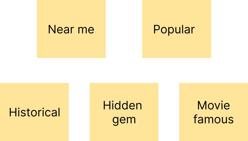
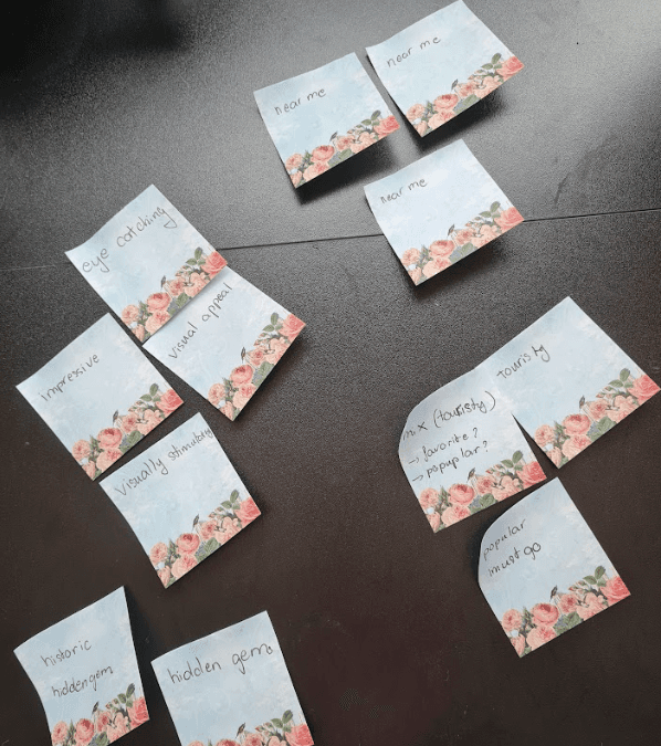
Research Synthesis
I grouped opinions that have similar themes/keywords together and noticed frequent patterns (see photo below). Users commonly search for near me, popular spots, historical, hidden gem or movie famous.
User Persona
Casual users vs. avid users.
Two user personas were discovered in the user research for the Gram City app. The first is casual users, who primarily use the app during their trips to search for places on the spot without heavy planning.
Meanwhile, avid users frequently rely on Gram City for detailed route planning before their trips and are highly engaged with all the features that Gram City provides.
"The Casual User" Persona - Nick Carter

Nick Carter
Age: 24
Location: Los Angeles, CA
Occupation: Video Editor
Bio
Nick usually doesn't have strict travel plans. He enjoys finding good spots for photos; however, he doesn't like to spend too much time researching or traveling out of his way to find the spots.
Goal
No strict travelling plan
No strict travelling plan
Search for places on the spot
Frustration
Miss out good photo spots near him
Miss out on travel experience
Nick's User Journey
BEFORE TRIP - SECONDARY JOURNEY
Enter place
Search "Near Me"
Save spots for later
DURING TRIP - MAIN JOURNEY
Refresh current location
Search "Near Me"
or
View "Saved Spots"
Pick spots
Navigate
"The Avid User" Persona - Sarah Mitchell

Sarah Mitchell
Age: 27
Location: Chicago, IL
Occupation: Event Production
Bio
In the past, Sarah took a photography class for personal interest. She is a more invested user than Nick, conducting deep research beforehand to ensure she can visit as many photo opportunities as possible.
Behavior
Try to visit as many places as possible
Take impressive photos for her Instagram
Frustration
Photo spots not as expected
Lack of inspirations of ways to take photos
Sarah's User Journey
BEFORE TRIP - MAIN JOURNEY
Enter place
Search "Most Popular"
View "Others' Photos"/
"Reviews"/"Hours"…
Save spots
DURING TRIP - SECONDARY JOURNEY
View "Saved Spots"
Navigate to spots
Check "Others' Photos"
/"Reviews"...
Check "Others'
Photos"/"Reviews"...
Review
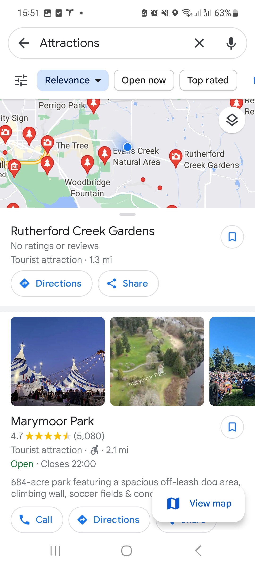
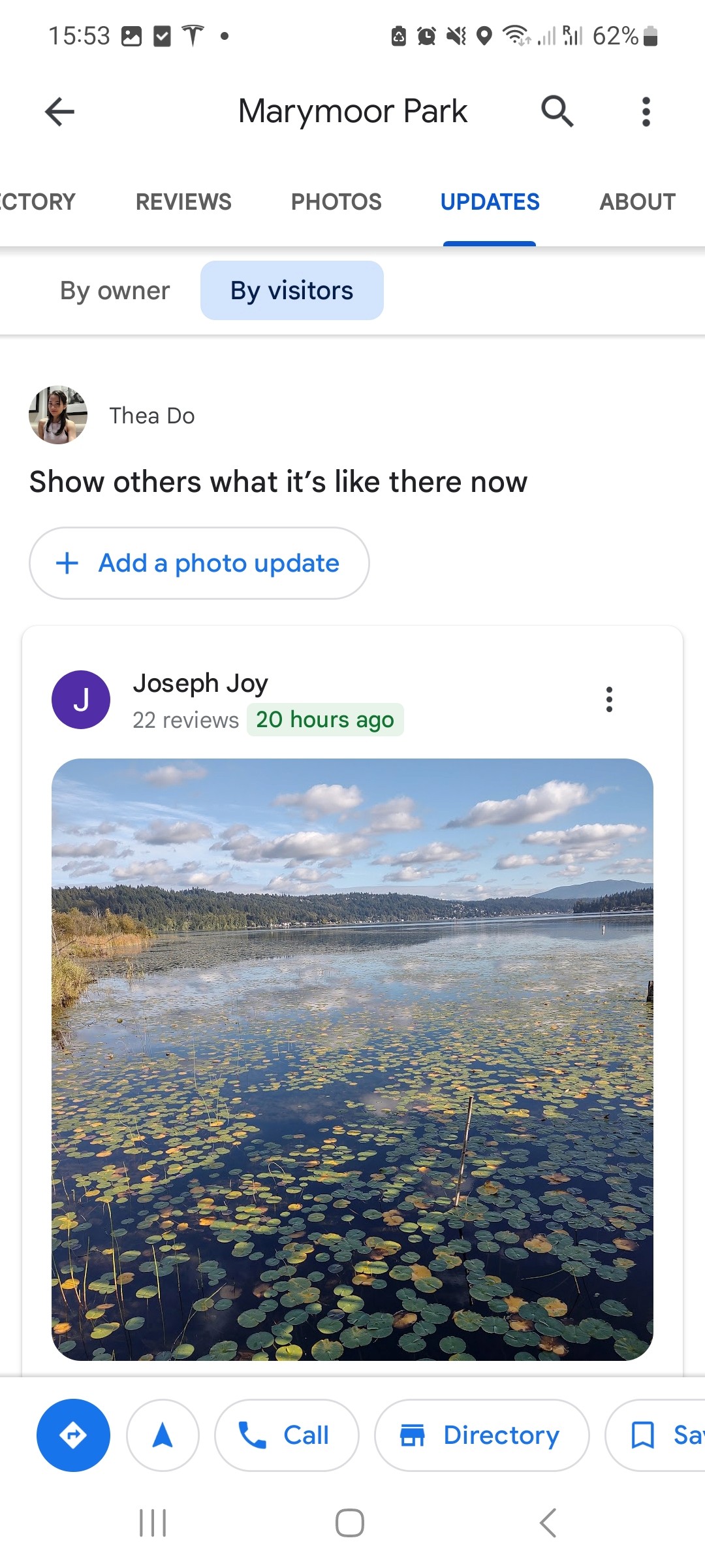
Competitive Analysis
I grouped opinions that have similar themes/keywords together and noticed frequent patterns (see photo below). Users commonly search for near me, popular spots, historical, hidden gem or movie famous.
Naver
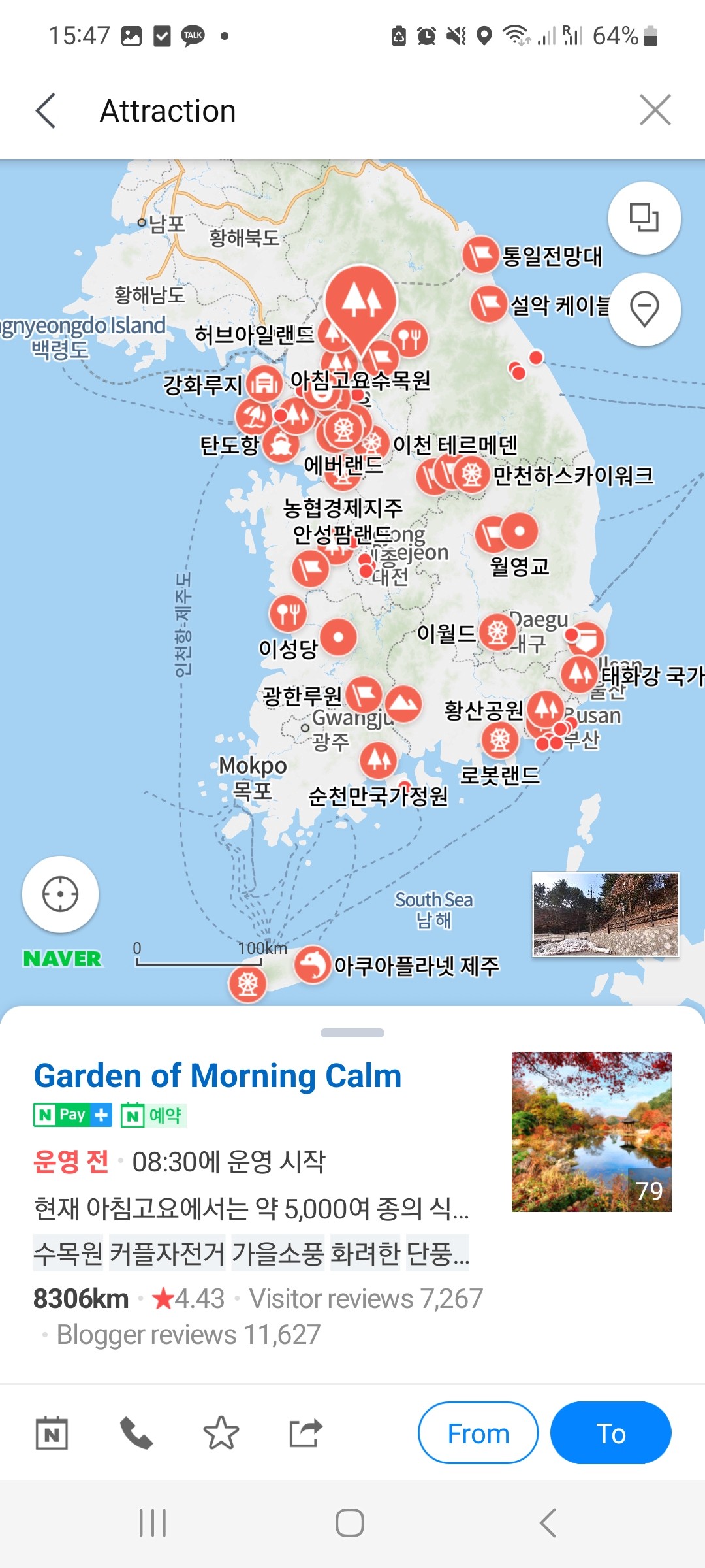
Strength :
All-in-one app
Diverse types of attraction
Influencers' reviews
Weakness :
Complex interface
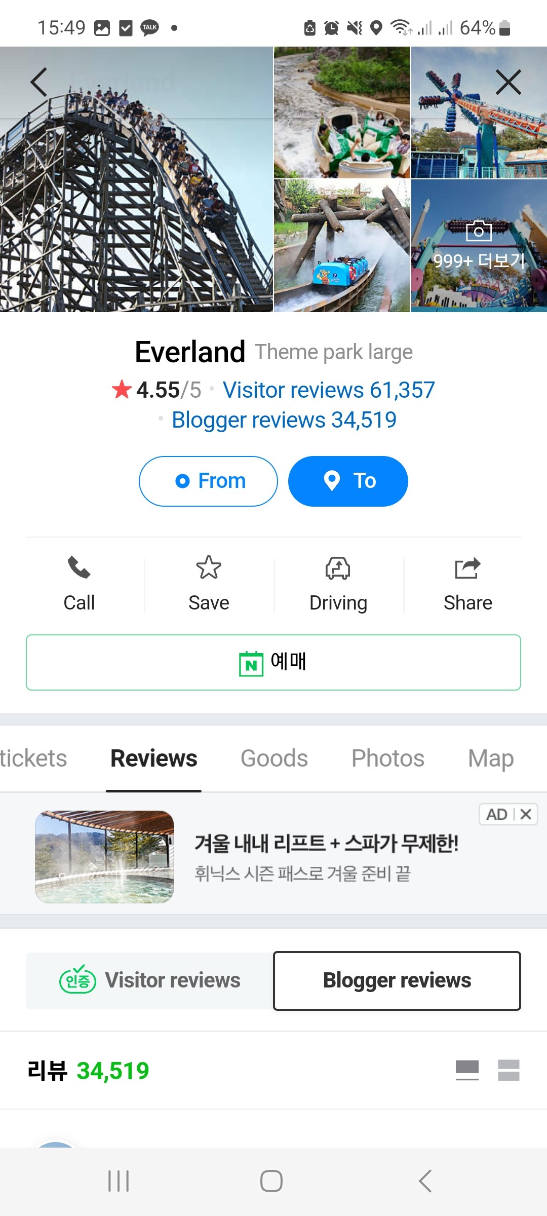
Strength :
Photography focused
Weakness :
Limited hashtag search
No review & navigation
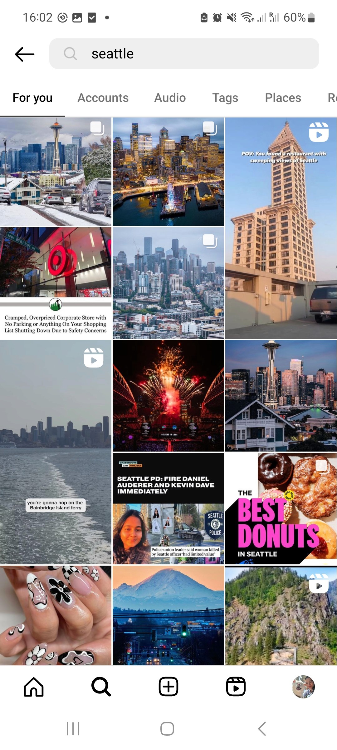
Strength :
Trusted search engine
Weakness :
General information, not photography focus
Define
How Might We
How might we design a straightforward app that tailors to the needs and goals of our two distinct personas, while simplifying the process of researching impressive photo-worthy spots and organizing travel around them?
Define
How Might We
How might we design a straightforward app that tailors to the needs and goals of our two distinct personas, while simplifying the process of researching impressive photo-worthy spots and organizing travel around them?
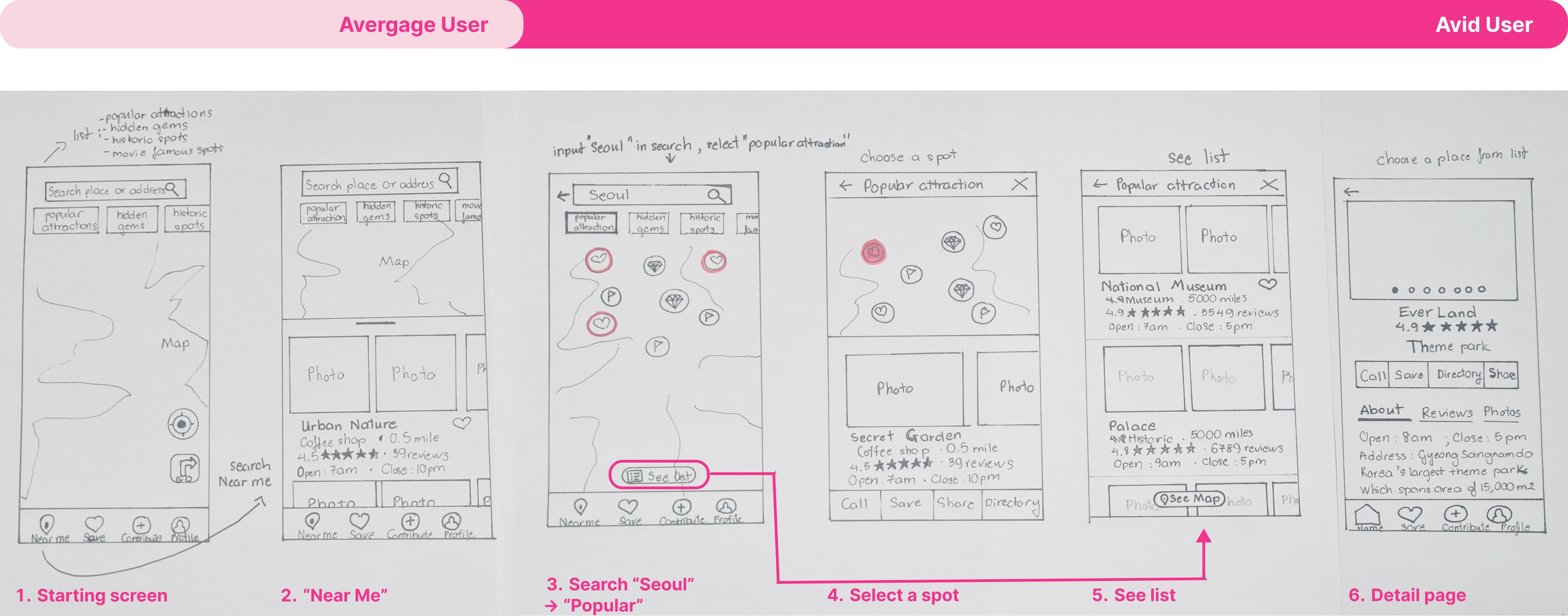
Design
Crazy 8s Sketches
The contrast in personalities of the two personas presents a challenge to my design approach.
I practiced Crazy 8s Sketches to sketch out a few ideas of the solution. The most complex screen to me is the home screen where we have to satisfy the need of both personas, Nick who prefers photo ops near him, and Sarah, who seek the most popular spots along with address, navigation and even reviews. Because of the complexity of information, my challenge was to present data in the cleanest way possible.
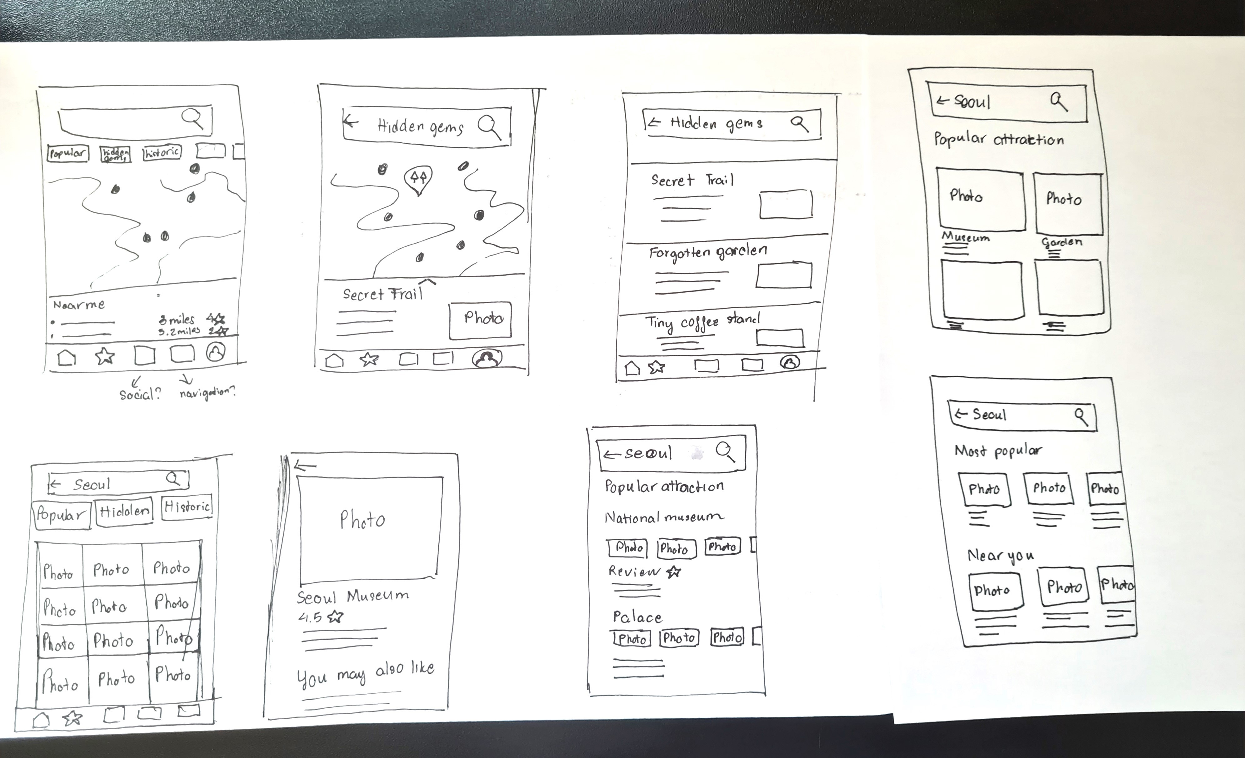
Storyboard
The average user primarily finds their spots on Screen 2, while the avid user makes decisions on Screen 6 - the Detail Page.
I practiced Crazy 8s Sketches to sketch out a few ideas of the solution. The most complex screen to me is the home screen where we have to satisfy the need of both personas, Nick who prefers photo ops near him, and Sarah, who seek the most popular spots along with address, navigation and even reviews. Because of the complexity of information, my challenge was to present data in the cleanest way possible.
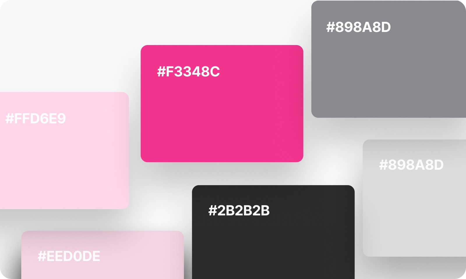
Color Palette
I used the bold pink from the brand logo to evoke a sense of happiness and a youthful vibe, enhancing brand recognition.
Design
Crazy 8s Sketches
The contrast in personalities of the two personas presents a challenge to my design approach.
I practiced Crazy 8s Sketches to sketch out a few ideas of the solution. The most complex screen to me is the home screen where we have to satisfy the need of both personas, Nick who prefers photo ops near him, and Sarah, who seek the most popular spots along with address, navigation and even reviews. Because of the complexity of information, my challenge was to present data in the cleanest way possible.
Storyboard
The average user primarily finds their spots on Screen 2, while the avid user makes decisions on Screen 6 - the Detail Page.
I practiced Crazy 8s Sketches to sketch out a few ideas of the solution. The most complex screen to me is the home screen where we have to satisfy the need of both personas, Nick who prefers photo ops near him, and Sarah, who seek the most popular spots along with address, navigation and even reviews. Because of the complexity of information, my challenge was to present data in the cleanest way possible.
Color Palette
I used the bold pink from the brand logo to evoke a sense of happiness and a youthful vibe, enhancing brand recognition.
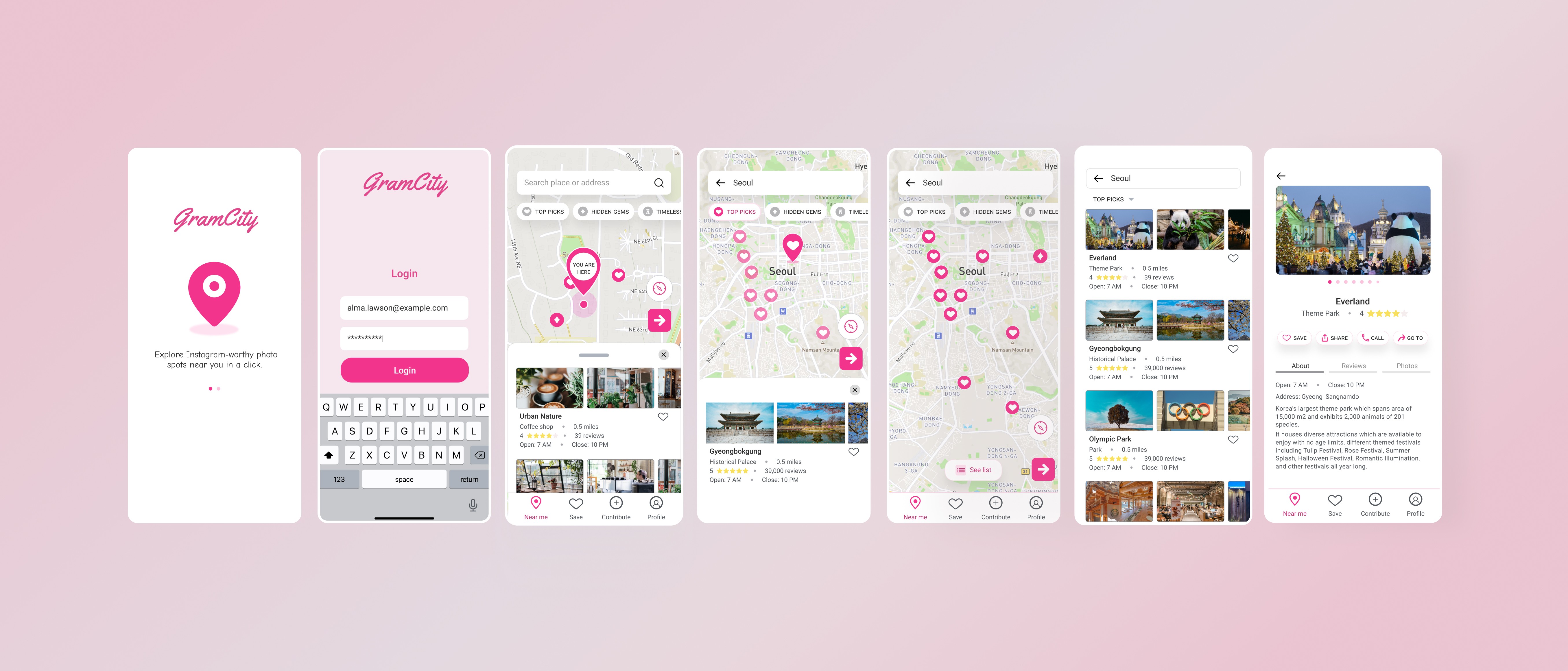
Prototype
Using ChatGPT to generate unique labels.
When it came to putting labels such as “popular attraction”, “hidden gems”, “historical spots” and “movie famous”, I faced a challenge trying to fit them on the mobile screen due to their length. Hence, I consulted Chat GPT to explore alternatives and decided on the following:
Popular Attraction
Top Picks
Hidden Gems
Hidden Gems
Historical Attraction
Timeless
Movie Famous
Screen Gems
Video
Live Prototype
Prototype
Using ChatGPT to generate unique labels.
When it came to putting labels such as “popular attraction”, “hidden gems”, “historical spots” and “movie famous”, I faced a challenge trying to fit them on the mobile screen due to their length. Hence, I consulted Chat GPT to explore alternatives and decided on the following:
Popular Attraction
Top Picks
Hidden Gems
Hidden Gems
Historical Attraction
Timeless
Movie Famous
Screen Gems
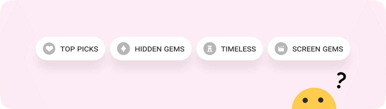
User Testing

Labels suggested by ChatGPT didn't resonate with users.
Only two out of five users associated “Top Picks” with popular attractions, primarily recognizing it through the heart icon. However, they expressed a preference for the term “popular attraction”, mirroring their familiarity with Google Maps.
User Testing
Test Result
Labels suggested by ChatGPT didn't resonate with users.
Only two out of five users associated “Top Picks” with popular attractions, primarily recognizing it through the heart icon. However, they expressed a preference for the term “popular attraction”, mirroring their familiarity with Google Maps.
Outcome
Lesson Learned
Gram City's users emphasized the importance of a effortless user experience over unique or concise labelling.
While ChatGPT was acknowledged as smart and helpful, I concern about the irrelevance of the information it provided to my target users. This mismatch led to an asynchronous user experience, highlighting a potential gap in user understanding. Additionally, my users emphasized the importance of a effortless user experience over unique or concise labelling.
Thank you for scrolling through!
Thank you for scrolling through!
Empathize
User Interview
Based on 10 interviews conducted for user research, I noticed a frequent theme in users' opinions about the types of places they want to photograph when traveling to a new area.
“If I’m in a new city, I like to get a good mix of typical touristy pictures in front of popular buildings and sites…”
"I’d rather find some good places near me that i can take photos of while I’m enjoying my time travelling. ”
"I’ll actually plan out the photos I want to take before hand-it’s worth it to go out of the way for a good one.”
Research Synthesis
I grouped opinions that have similar themes/keywords together and noticed frequent patterns (see photo below). Users commonly search for near me, popular spots, historical, hidden gem or movie famous.
User Persona
Casual users vs. avid users.
Two user personas were discovered in the user research for the Gram City app. The first is casual users, who primarily use the app during their trips to search for places on the spot without heavy planning.
Meanwhile, avid users frequently rely on Gram City for detailed route planning before their trips and are highly engaged with all the features that Gram City provides.
"The Casual User" Persona - Nick Carter
Nick Carter
Age: 24
Location: Los Angeles, CA
Occupation: Video Editor
Bio
Nick usually doesn't have strict travel plans. He enjoys finding good spots for photos; however, he doesn't like to spend too much time researching or traveling out of his way to find the spots.
Goal
No strict travelling plan
Search for places on the spot
Frustration
Miss out good photo spots near him
Miss out on travel experience
Nick's User Journey
BEFORE TRIP - SECONDARY JOURNEY
Enter place
Search "Near Me"
Save spots for later
DURING TRIP - MAIN JOURNEY
Refresh current location
Search "Near Me"
or
View "Saved Spots"
Pick spots
Navigate
"The Avid User" Persona - Sarah Mitchell
Sarah Mitchell
Age: 27
Location: Chicago, IL
Occupation: Event Production
Bio
In the past, Sarah took a photography class for personal interest. She is a more invested user than Nick, conducting deep research beforehand to ensure she can visit as many photo opportunities as possible.
Behavior
Try to visit as many places as possible
Take impressive photos for her Instagram
Frustration
Photo spots not as expected
Lack of inspirations of ways to take photos
Sarah's User Journey
BEFORE TRIP - MAIN JOURNEY
Enter place
Search "Most Popular"
View "Others' Photos"/
"Reviews"/"Hours"…
Save spots
DURING TRIP - SECONDARY JOURNEY
View "Saved Spots"
Navigate to spots
Check "Others'
Photos"/"Reviews"...
Review
Competitive Analysis
I grouped opinions that have similar themes/keywords together and noticed frequent patterns (see photo below). Users commonly search for near me, popular spots, historical, hidden gem or movie famous.
Naver
Strength :
All-in-one app
Diverse types of attraction
Influencers' reviews
Weakness :
Complex interface
Strength :
Photography focused
Weakness :
Limited hashtag search
No review & navigation
Strength :
Trusted search engine
Weakness :
General information, not photography focus