

Overview
Overview
The Team
UX Lead (Me)
2 UX Designers
Timeline
4 weeks
Responsibilities
Competitor Analysis
Persona
Design
Prototype
Testing
The Problem
The Dinner Daily is a web-based platform that offers weekly meal plans and grocery shopping assistance. The company was experiencing a concerning retention rate. The hypothesis is that users were struggling to perform essential tasks on the dashboard, which led to a low return rate, affecting user satisfaction and retention.
The Solution
We enhanced the dashboard interface by simplifying the user journey and providing a flexible, intuitive experience while highlighting The Dinner Daily's key services. The new design delivers a seamless experience with vibrant colors and smooth animations that delight users.
The Achievement
The improved design achieved a 100% success rate in completing two essential tasks: navigating the weekly meal plan and generating the grocery list.
The Team
2 UX Designers
UX Lead (Me)
Timeline
4 weeks
Responsibilities
Competitor Analysis
Persona
Design
Prototype
Testing
The Problem
The Dinner Daily is a web-based platform that offers weekly meal plans and grocery shopping assistance. The company was experiencing a concerning retention rate. The hypothesis is that users were struggling to perform essential tasks on the dashboard, which led to a low return rate, affecting user satisfaction and retention.
The Solution
We enhanced the dashboard interface by simplifying the user journey and providing a flexible, intuitive experience while highlighting The Dinner Daily's key services. The new design delivers a seamless experience with vibrant colors and smooth animations that delight users.
The Achievement
The improved design achieved a 100% success rate in completing two essential tasks: navigating the weekly meal plan and generating the grocery list.
Process
Empathize
Stakeholder Interview
Design Critique
Competitive Analysis
Persona
Define
Problem Statement
Design
User Flow
Ideation
High Fidelity
Prototype
Visual Design
Test
User Testing
Process
Empathize
Stakeholder Interview
Design Critique
Competitive Analysis
Persona
Define
Problem Statement
Design
User Flow
Ideation
High Fidelity
Prototype
Visual Design
Test
User Testing
Empathize
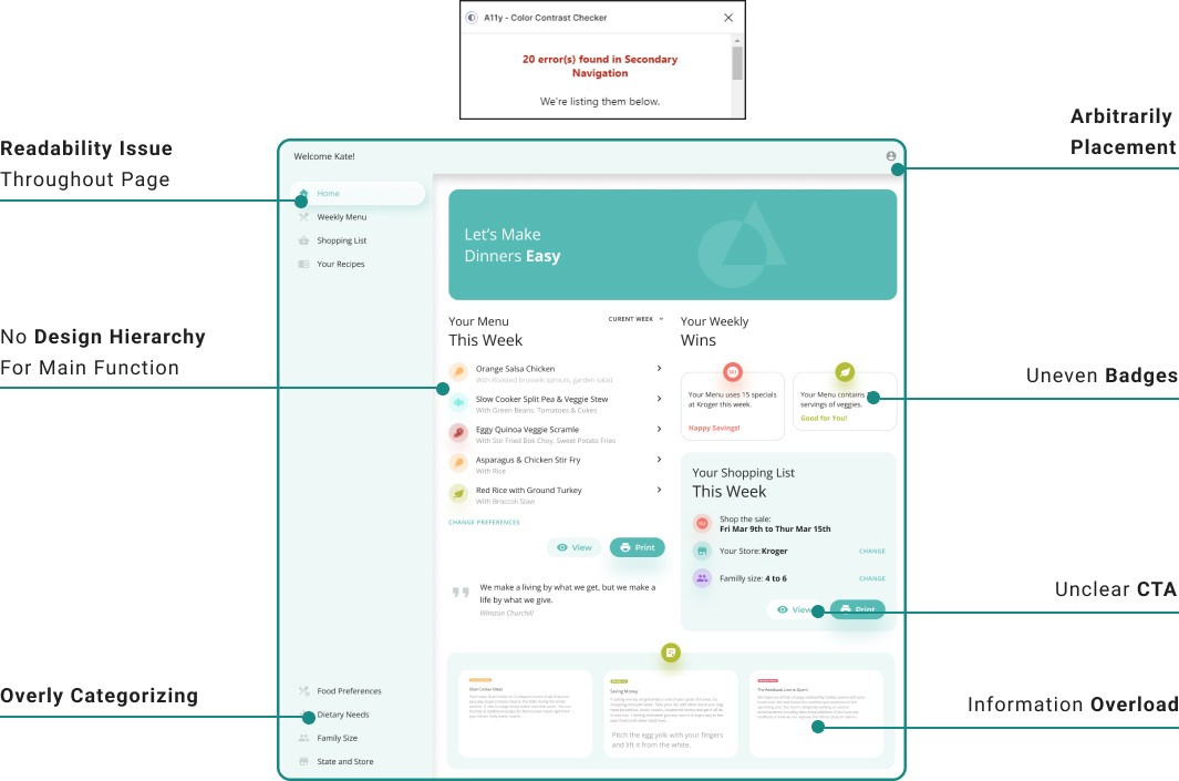
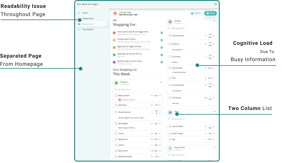
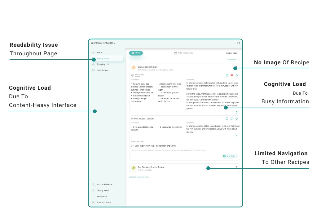
Design Critique
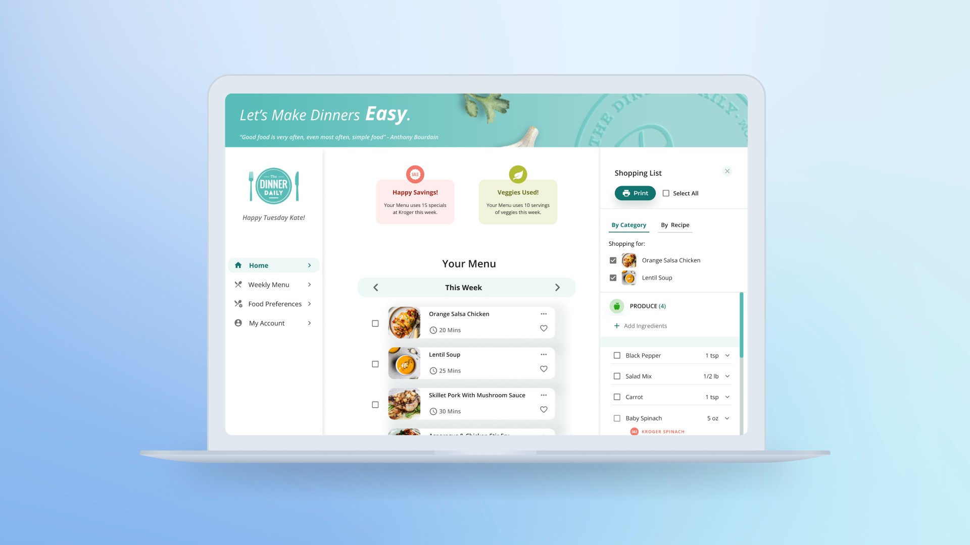
Reflecting current dashboard design with UX Principles.
I conducted a comprehensive analysis of the main dashboard including Homepage, Shopping List, and Recipe page to identify problem areas for improvement.
HOMEPAGE
SHOPPING LIST PAGE
RECIPE PAGE
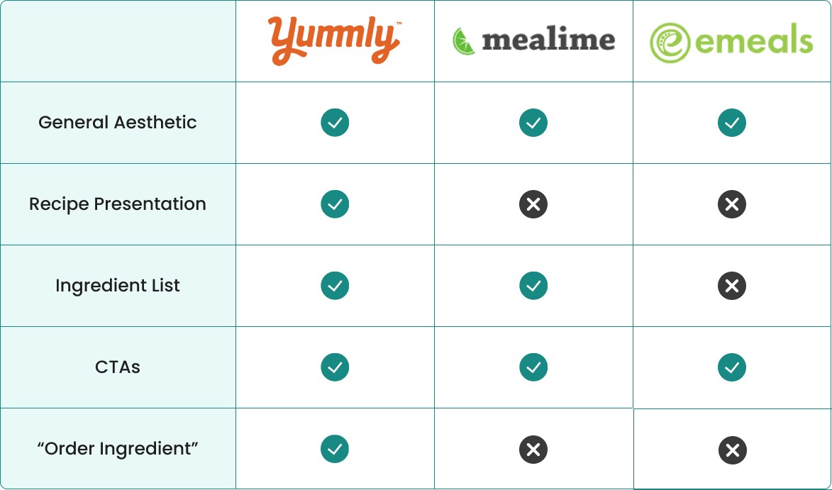
Competitive Analysis
Competitive benchmarking revealed actionable design strategies we can implement.
Utilizing insights gained from analyzing current designs , I have identified key factors to focus on during our competitive analysis phase. Our objective is to examine how competitors of The Dinner Daily have addressed similar challenges and derive learnings from their approaches. These factors include:
1
General Aesthetic
Is it pleasing? Does it communicate the essential tasks?
2
Recipe Presentation
Is it inspiring? Is the meal plan intuitive and customizable?
3
Ingredient List
Is it editable? Does it provide flexibility in viewing the list?
4
CTA Buttons
Are there clear affordances for key features?
5
Order Function
Is it intuitive to generate online order from the grocery list?
Insights gained from our competitor-Yummly design strategies.
After examining online forums and reviews, we identified competitors with dashboards addressing similar challenges. We studied Yummly, Mealime, and Emeal. Especially, Yummly showcases well crafted user experience from presenting weekly meal plans and generating ingredient shopping lists, serving as a primary source of inspiration for our project.
User Persona
Our persona, Kate prioritizes healthy eating habit for her family but struggle to find time to plan meals and cook.
I collaborated with our stakeholder to develop 'Kate,' the user persona for The Dinner Daily.

"It's better be quick. It's better
be easy, and my kids better eat it."
"It's better be quick. It's better
be easy, and my kids better eat it."
Kate Thompson
Age: 42
Location: Boston, MA
Family: Married, 3 kids
Occupation: Accountant
Bio
Kate is a busy professional, trying to balance her career and her role as a mother. She prefers cooking at home to ensure her family eats healthily and keeps household expenses under control.
Goal
Prioritize healthy eating habit.
Take advantages of promotion at local stores.
Minimize the effort to prepare meals.
Frustration
Find the time and energy to cook.
Have recipes that everyone in the family likes.
Gather all ingredients needed for a recipe.
Empathize
Design Critique
Reflecting current dashboard design with UX Principles.
I conducted a comprehensive analysis of the main dashboard including Homepage, Shopping List, and Recipe page to identify problem areas for improvement.
HOMEPAGE
HOMEPAGE
SHOPPING LIST PAGE
SHOPPING LIST PAGE
RECIPE PAGE
RECIPE PAGE
Competitive Analysis
Competitive benchmarking revealed actionable design strategies we can implement.
Utilizing insights gained from analyzing current designs , I have identified key factors to focus on during our competitive analysis phase. Our objective is to examine how competitors of The Dinner Daily have addressed similar challenges and derive learnings from their approaches. These factors include:
1
General Aesthetic
Is it pleasing? Does it communicate the essential tasks?
2
Recipe Presentation
Is it inspiring? Is the meal plan intuitive and customizable?
3
Ingredient List
Is it editable? Does it provide flexibility in viewing the list?
4
CTA Buttons
Are there clear affordances for key features?
5
Order Function
Is it intuitive to generate online order from the grocery list?
Insights gained from our competitor-Yummly design strategies.
After examining online forums and reviews, we identified competitors with dashboards addressing similar challenges. We studied Yummly, Mealime, and Emeal. Especially, Yummly showcases well crafted user experience from presenting weekly meal plans and generating ingredient shopping lists, serving as a primary source of inspiration for our project.
User Persona
Our persona, Kate prioritizes healthy eating habit for her family but struggle to find time to plan meals and cook.
I collaborated with our stakeholder to develop 'Kate,' the user persona for The Dinner Daily.
"It's better be quick. It's better
be easy, and my kids better eat it."
"It's better be quick. It's better
be easy, and my kids better eat it."
Kate Thompson
Age: 42
Location: Boston, MA
Family: Married, 3 kids
Occupation: Accountant
Bio
Kate is a busy professional, trying to balance her career and her role as a mother. She prefers cooking at home to ensure her family eats healthily and keeps household expenses under control.
Goal
Prioritize healthy eating habit.
Take advantages of promotion at local stores.
Minimize the effort to prepare meals.
Frustration
Find the time and energy to cook.
Have recipes that everyone in the family likes.
Gather all ingredients needed for a recipe.
Define
How Might We
How might we design a clean and inspiring interface that clearly communicates essential tasks like meal planning and grocery list generation, while allowing users the flexibility to edit, in order to simplify their meal planning, grocery shopping, and cooking experience?
Define
How Might We
How might we design a clean and inspiring interface that clearly communicates essential tasks like meal planning and grocery list generation, while allowing users the flexibility to edit, in order to simplify their meal planning, grocery shopping, and cooking experience?
Design
User Flow
Simplify the "generate shopping list" task by one click.
Instead of requiring users to navigate to a separate page to view their shopping list, I implemented a pop-up feature on the homepage that appears when users generate the list.
Old flow
Homepage
Shopping List Page
New Flow
Homepage
Shopping List Pop-up
Ideation
The client and I have different perspectives on the new interface design.
During ideation, I simplified the interface by removing non-essential elements and using photography to represent the recipes. The client was hesitant about these changes. We listened to each other's reasoning and worked to find a middle ground that balanced both business and user goals.
Our discussion about removing non-essential elements.

The current interface layout.

Our discussion about replacing icons with photography.

The use of photography.

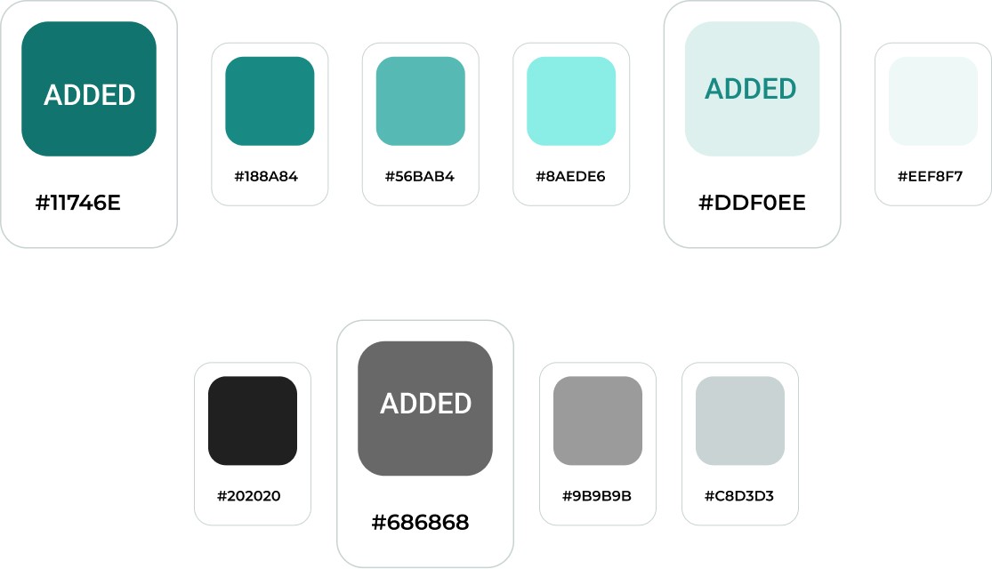
Color Palette
Adding more colors to the current palette to enhance readability, contrast, and overall visual appeal.
I added three shades of color by adjusting the tints of the current brand colors.
High Fidelity
The new design accelerates users in task completion and satisfy UX principles.
While working on the high fidelity design, I ensured that design decisions addressed the client's concerns, problematic areas and our How Might We question.
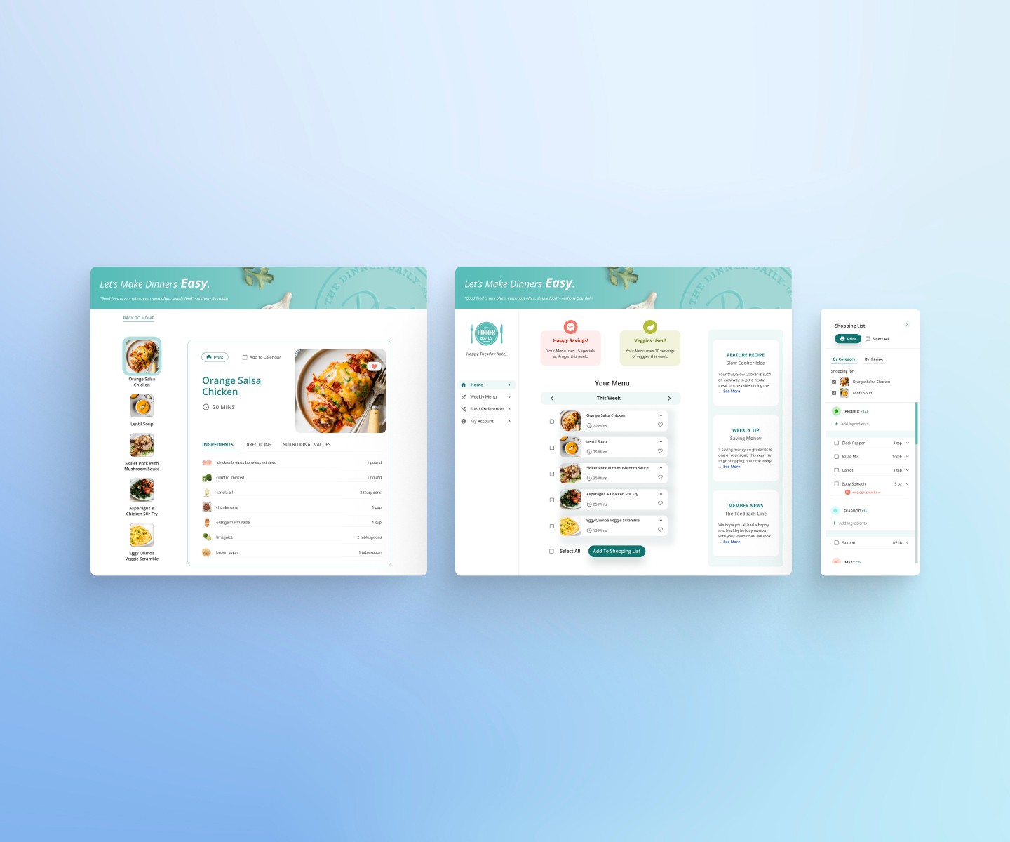
HOMEPAGE
HOMEPAGE
RECIPE PAGE
RECIPE PAGE
Final Design
The final design turned out to be efficient, elegant, and inspiring.
Design
User Flow
Simplify the "generate shopping list" task by one click.
Instead of requiring users to navigate to a separate page to view their shopping list, I implemented a pop-up feature on the homepage that appears when users generate the list.
Old flow
Homepage
Shopping List Page
New Flow
Homepage
Shopping List Pop-up
Ideation
The client and I have different perspectives on the new interface design.
During ideation, I simplified the interface by removing non-essential elements and using photography to represent the recipes. The client was hesitant about these changes. We listened to each other's reasoning and worked to find a middle ground that balanced both business and user goals.
Our discussion about removing non-essential elements.
The current interface layout.
Our discussion about replacing icons with photography.

The use of photography.
Color Palette
Adding more colors to the current palette to enhance readability, contrast, and overall visual appeal.
I added three shades of color by adjusting the tints of the current brand colors.
High Fidelity
The new design accelerates users in task completion and satisfy UX principles.
While working on the high fidelity design, I ensured that design decisions addressed the client's concerns, problematic areas and our How Might We question.
HOMEPAGE
RECIPE PAGE
Final Design
The final design turned out to be efficient, elegant, and inspiring.
Prototype
Play video to view our prototype in action.
Video
Live Prototype
Prototype
Play video to view our prototype in action.
User Testing
Test Result
100% successful rate in completing essential tasks.
All testers could seamlessly complete essential tasks such as managing meal plans and generating grocery lists during usability testing. Additionally, the users commented that they appreciated the clean and inspiring design.

User Testing
Test Result
100% successful rate in completing essential tasks.
100% successful rate in completing essential tasks.
All testers could seamlessly complete essential tasks such as managing meal plans and generating grocery lists during usability testing. Additionally, the users commented that they appreciated the clean and inspiring design.
Outcome
We successfully delivered the project on time with no major issues over the course of four weeks. The client expressed satisfaction with our final design and intends to proceed with its implementation. Additionally, our stakeholder gave glowing reviews:
"The team was extremely helpful in providing design revisions for our existing application. We have some known challenges with the UI/UX of our app, and I found the revised designs a great step forward in fixing some fundamental issues."

Laurin Mills-The Dinner Daily's CEO
Achievement
Outcome
Achievement
- Laurin Mills, The Dinner Daily's CEO
Laurin Mills-The Dinner Daily's CEO
We successfully delivered the project on time with no major issues over the course of four weeks. The client expressed satisfaction with our final design and intends to proceed with its implementation. Additionally, our stakeholder gave glowing reviews:
"The team was extremely helpful in providing design revisions for our existing application. We have some known challenges with the UI/UX of our app, and I found the revised designs a great step forward in fixing some fundamental issues."